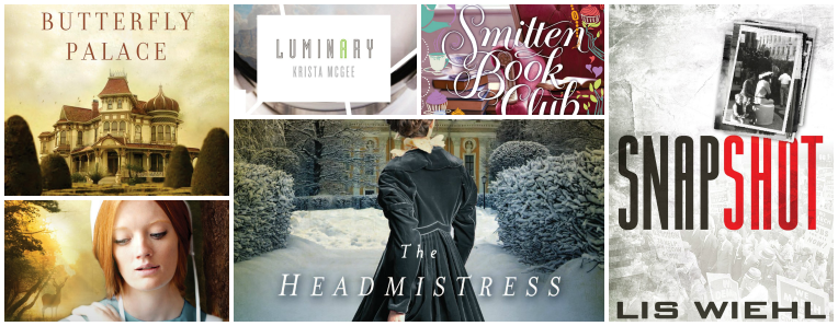
Here’s the rest of Thomas Nelson’s early 2014 releases with Amish, suspense, historical and YA offerings.
There’s some hit and miss for me in this selection.
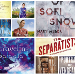
LOVE Lis Wiehl’s cover – it’s eye~catching, pertinent to the title, and I love the red against the monotone backdrop. Love!
Sarah’s Ladd’s is gorgeous – the muted tones enhance the richness of the gown in the foreground and as I prefer imagining characters myself, I enjoy the mysteriousness of not seeing the model’s face.
I don’t mind Colleen’s cover but it just doesn’t fit with the title in my mind. “Butterfly Palace” conjures up a pretty, light filled building in my mind so the mellow tones and overcast sky just seems at odds to me. The colours are quite similar to her Tidewater Inn so I thought it was another contemporary in the same series rather than a new historical novel.
As for Ruth’s, we’ve said this before but I’ve never seen so much mascara and eyeliner on an Amish character – to me it really detracts from the cover, as does the wealth of hair she is showing. It’s a shame as I actually quite like the downcast eyes and the solitary deer in the background.
Luminiary doesn’t appeal to me but I’m happy to put that down to the years under my belt since I was a young adult – LOL!
As for Smitten Book Club, while I love the background of the cerise chair and the book stack, the font and artwork overwhelms the cover and makes it way too fussy and busy for my taste.
Bring on your thoughts! I love hearing them – especially when others have thoughts different to mine. I always love that others like a cover I don’t – makes me feel happy for the author and publisher!
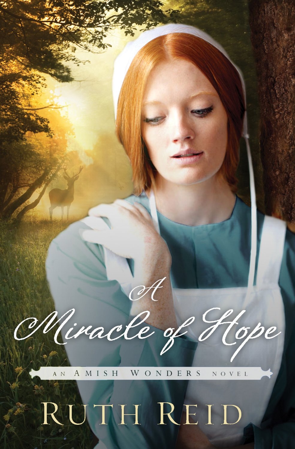 A Miracle of Hope by Ruth Reid
How far can God’s mercy reach?
Lindie Wyse is pregnant out of wedlock and thinks an arranged marriage is the only way to preserve her future. Josiah Plank is certain he’ll never love again, but he needs someone to care for his eight-year-old daughter, Hannah. The two take on their arrangement tentatively at first but soon realize they are each in for more than they imagined.
Lindie experiences a breakthrough with Hannah when she recognizes Hannah’s special gifts, but a risky pregnancy and serious health issues threaten to demolish the foundation Josiah and Lindie are building. Will their growing love survive despite their struggles, or will their hearts become as cold as the northern winter?
December, 2013
The Headmistress of Rosemere by Sarah E. Ladd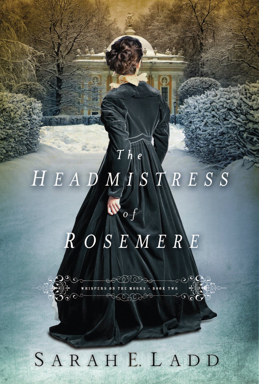
Patience Creighton will finally find the peace she lost years ago—if she can open her heart and forgive the man who loves her.
Bright, sensible Patience knows what is expected of her. At twenty-five, her opportunity for a family of her own has passed, so she finds contentment teaching at her father’s school for girls. When her father dies suddenly and her brother moves away to London, she is determined to keep her father’s dream alive.
Confirmed bachelor William Sterling also knows what is expected of him, but mistake after mistake has left him teetering on ruin’s edge. As master of Eastmore Hall he owns a great deal of land but possesses little money to manage the upkeep. He is desperate to find a new source of income, including the sacrifice of land connected to Rosemere.
When her brother returns with a new wife to take over management of the school, Patience is heartbroken to no longer be responsible for her beloved school and is forced to reassess God’s purpose for her life. After her sister-in-law’s matchmaking brings Patience and William together, they both learn new truths about their character and find a common goal in restoring Eastmore’s legacy.
December, 2013
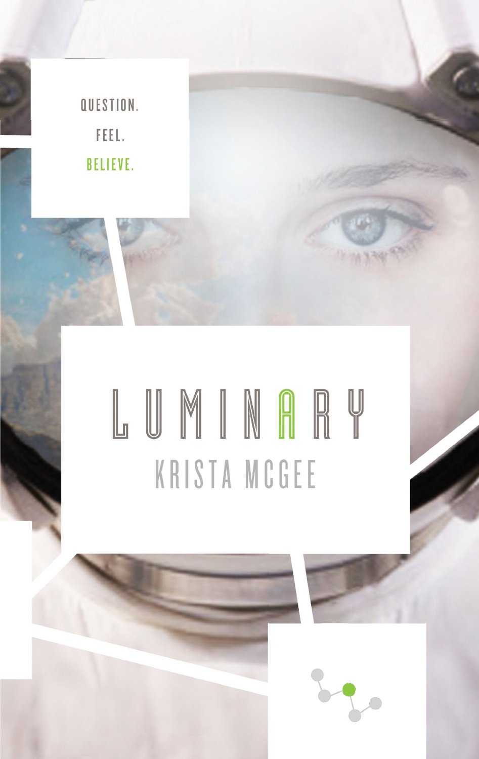 Luminary by Krista McGee
She was an anomaly with a death sentence. Now she’s free.
Thalli was scheduled for annihilation. She was considered an anomaly—able to experience emotions that should have been eradicated by genetic modification. The Scientists running the State couldn’t allow her to bring undue chaos to their peaceful, ordered world. But seconds before her death, she is rescued.
Now Thalli is above ground in a world she thought was destroyed. A world where not even the air is safe to breathe. She and her three friends must journey across this unknown land, their destination a hidden civilization. It’s their only chance of survival.
Broken and exhausted after an arduous journey, they arrive in New Hope, a town that survived the nuclear holocaust. When Thalli meets the people there—people actually born to families—her small world is blown wide open.
Soon after their arrival to New Hope, the town comes under attack. She has escaped imminent death, but now Thalli is thrust into a new fight—a fight to save her new home. Does she know enough about this world of emotions, this world of chaos, to save not only herself, but the people she has come to love?
January, 2014
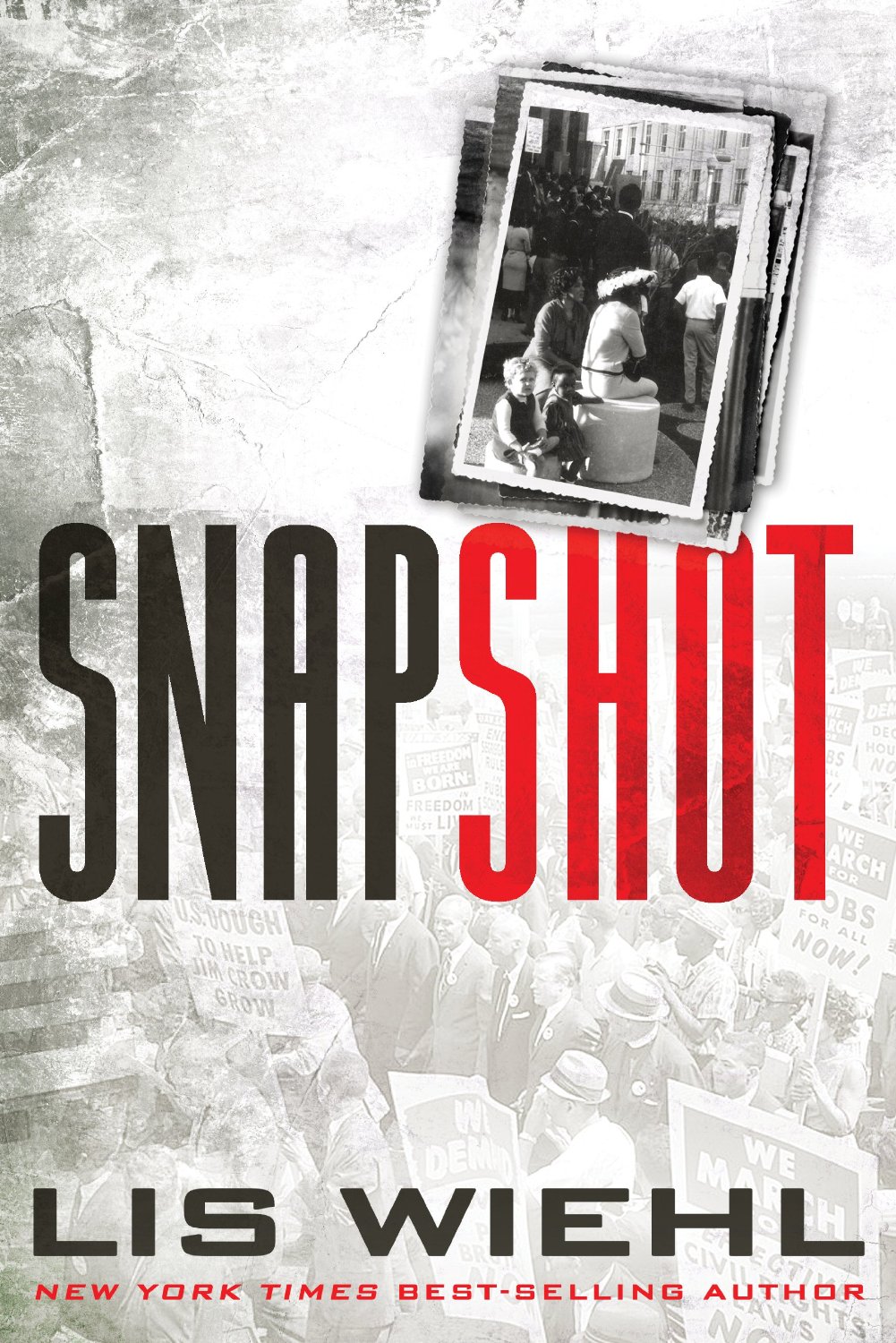 Snapshot by Lis Wiehl & Cindy Martinusen-Coloma
Two little girls, frozen in black and white. One picture worth killing for.
Federal prosecutor Lisa Waldren’s estranged father wants her to investigate a cold case from his FBI days. Lisa nearly refuses, even though a wrongly convicted man faces execution for murder. Then her father reveals a photograph: a little white girl playing alongside a little black girl at a civil rights rally in 1965 where the crime—the shooting of a civil rights leader—took place. She recognizes herself in the photo.
She was there.
Lisa agrees to help, resolved to boldly seek answers she’s skirted for decades. What she discovers are layers of deception, both personal and professional, reaching as high as the head of the FBI. Possibly even the president.
And though Lisa and the other girl may have escaped the 1965 shooting physically unharmed, her little friend, now grown, bears the scars of it. All because of the color of her skin. As Lisa and her father get closer to the truth, the real killer turns the hunt around.
January, 2014
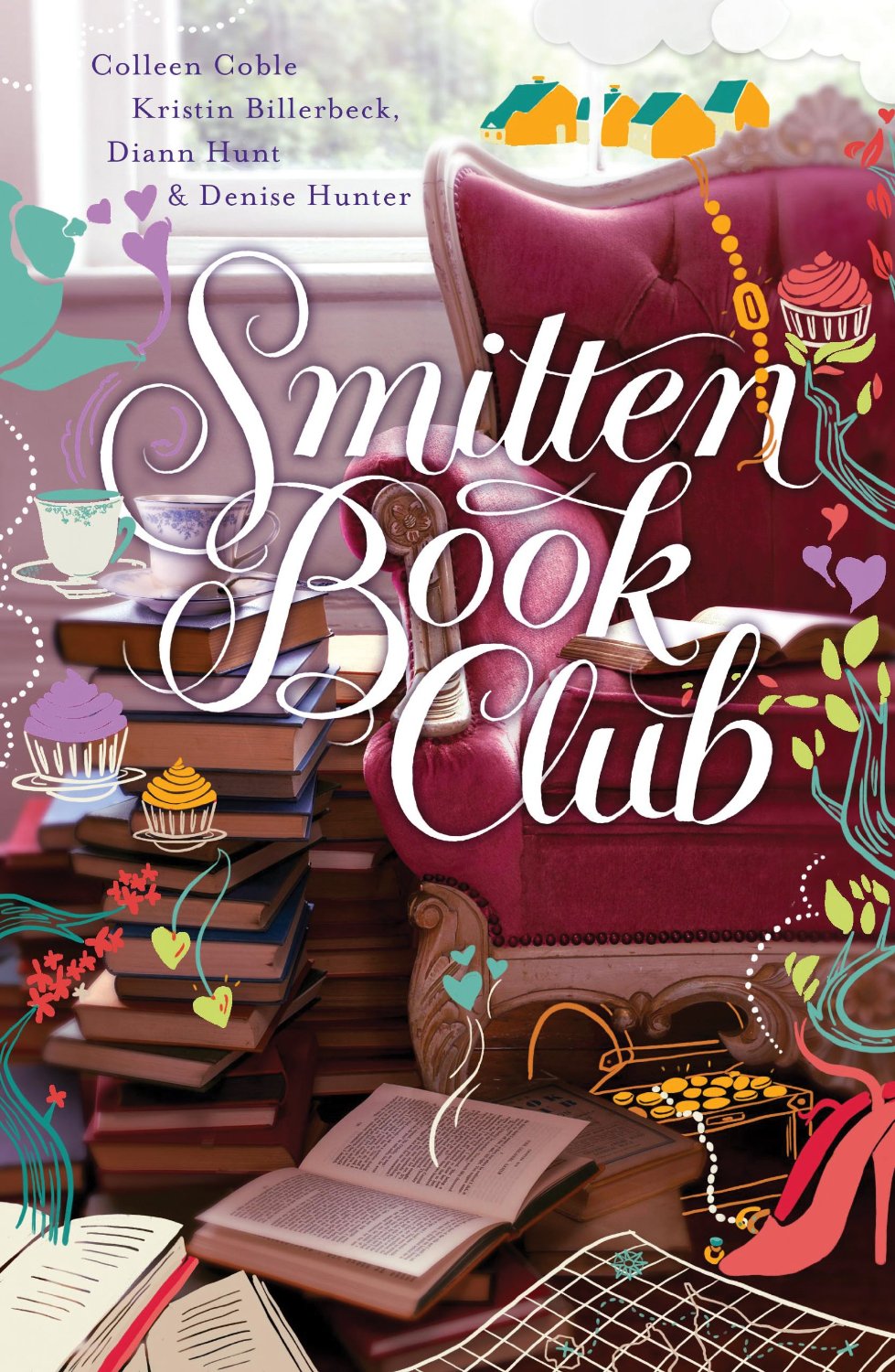 Smitten Book Club by Colleen Coble, Denise Hunter, Kristen Billerbeck, & Diann Hunt
“Consider that your beau is like a coveted novel whose compelling first lines you’ve just begun to read.” —A Gentlewoman’s Guide to Love and Courtship
At a rummage sale, Heather, a member of the Fireside Book Club, discovers a turn-of-the-century romantic advice book written by a once-famous Smitten, Vermont, resident. When she shares the precious volume with her friends in the club, they find clues about a hidden treasure rumored to be buried in their tiny town.
As Heather, Abby, Lia, and Molly take turns reading the book, each projects onto it her own literary tastes. Heather sees it as a mystery. Abby discovers delicious dashes of Jane Austen. Lia sees in it the idealism of a bygone day. And Molly just wishes they’d made the book into a movie!
One by one, each of the women finds romantic love—often in spite of the historic book’s advice. And in searching for the legendary gold, the friends discover the best kind of treasure. The kind that brings hope and healing to each of their hearts.
January, 2014
Butterfly Palace by Colleen Coble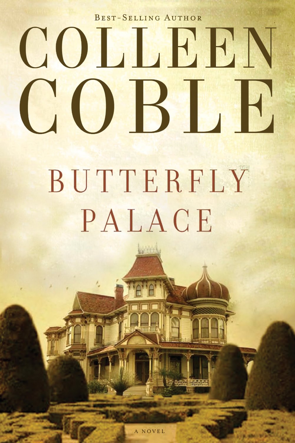
Lilly secures a job as lady’s maid in a grand manor in Austin, Texas. But even far from home, her past lurks around every corner.
When Lilly Donnelly arrives at the Cutlers’ famed Butterfly Mansion in 1899, the massive house and unfamiliar duties threaten to overwhelm her. Victorian Austin is lavish, highly political, and intimidating, but with the help of the other servants, Lilly resolves to prove herself to her new employers.
Then, while serving at an elegant dinner party, Lilly recognizes one distinguished guest as Andrew, the love of her life, who abandoned her without a word back home. He seems to have assumed a new identity and refuses to acknowledge her, leaving her confused and reeling.
Before Lilly can absorb this unwelcome news, she’s attacked. Could it be the sinister Servant Girl Killer who has been terrorizing Austin? Or is it someone after something more personal—someone from her past?
Does she dare trust Andrew to help or is he part of the danger threatening to draw Lilly into its vortex?
January, 2014


July 1, 2013 at 6:23 pm
Top of the morning to you, Rel! (It’s 3AM here as I am writing. 🙂 Always, always like seeing these posts and leaving a thought or two… or three at times come to think of it. :))
So let’s see.
Lis Wheil’s… Hmmm. I actually don’t really like that cover. It lacks color, in my opinion and its design could be more creative. Too simple. I like simple designs but usually when there’s a bit of a creative touch added to them and with that in mind, I’ll say Sarah E Laudd’s cover looks very intriguing. I agree with your thoughts on it! It’s a very attracting cover – mysterious and fitting to the setting of the story. Look at that faded yellow in the background – either signaling a sunrise or a sunset – it joins the rich blue of the model’s dress along with the light blue on the snow really nicely…
Oh my…. I really do like it. I am feasting my eyes! *Grin*
I also like the colors on Ruth’s cover. Very still, quiet and soft colors. Looking at the cover prompts me to recall the peace I feel rising early in the morning (like today!). The model’s vulnerable posture and the dear behind her crowns it all nicely. I think it oozes with harmony and hope. It’s plain but the color combinations really help in drawing a reader.
Smitten Book Club. Hmmm…. Well. I sort of like it… I think. I’m afraid there are too many froufrous added for my taste but I sort of like it. It’s a bit hard to explain. I think I ‘like’ it in a sense, because it reminds of this series I used to read when I was younger. I agree with your thoughts on Butterfly Place’s cover. The lack of cover is not very fitting to the title – it throws me off a bit. But come to think of it, the designers probably purposely refrained from adding color to create an irony between the title and the cover, which would serve in drawing a reader? (If so, it doesn’t draw me unfortunately!)
Luminary, Luminary.. Thumbs up or down? Hmmmm. I’d say thumbs in the middle.. I think it has a sense of dangerous adventure attached to it – the mask and the sky in the background highlight that for me.
I definitely choose Sarah E. Laudd’s cover as the winner among all of them!
ALWAYS like these posts. Thanks for sharing, Rel!
July 2, 2013 at 4:50 am
*Lack of color instead of lack of cover – sorry – for the thought about Butterfly’s Place.
July 3, 2013 at 1:42 pm
Ganise » I feel like I should be your mother and tell you to get to bed but I’m a night or too late now – hehe!
Again, you have lots of good thoughts that I love reading. Thanks for sharing in the wee hours of your morning, my friend 🙂
July 3, 2013 at 10:50 pm
I’m actually an early bird. 🙂 I woke up at 3 suddenly that day but went back to sleep afterward. Thanks for reading, Rel… even though mine was a long comment.(Which probably explains while I fell asleep tired that day… along with the fact that it was too early. But it was blissful! Peace.. quiet.)
July 1, 2013 at 8:27 pm
Like you, loving Lis and Sarah’s. The rest I like some aspects of, but not others. Similarly, least favorite is A Miracle of Hope – the eyeliner doesn’t bother me as much as the placement of the arm/hand, it just seems really awkward. Though I do like the colors!
July 3, 2013 at 1:41 pm
Kara I » 🙂 Agree! xo
July 1, 2013 at 9:54 pm
All I can say is that I’ve never seen an Amish woman in my area looking as glamorous as they are on book covers.
Smitten Book Club is way too fussy. It’s like someone’s gone overboard on one of those photo apps. Take a photo and mess with it. Cupcakes in mid-air? Duplicates of the open books and cup and saucer? Why not add in an actual map instead of a badly drawn illustration? Such a shame.
Luminary follows Anomaly. They’ve both got that sci-fi, laboratory stark look.
I’m not sure about Headmistress. Is she trying to lift her dress or scratch an itch? Because she’s not doing a very good job at keeping her dress out of the snow!
Nothing to say about Snapshot except it’s probably my favourite. Both photographs capture the elements of the plot. And the muted look of the background indicates something that happened in the past.
July 3, 2013 at 1:40 pm
Sally M » Thanks for sharing, Sally – you make me smile!
July 1, 2013 at 11:46 pm
My favorite cover is Sarah Ladd’s. It says a lot while saying a little. I agree that Smitten Book Club looks rather busy. And I like Luminary. YA fiction is really getting popular now and this cover rivals secular novels…which is good because it might draw new readers to Christian YA.
July 3, 2013 at 1:39 pm
Embassie » I agree with you on Luminary, Embassie – good points!
July 2, 2013 at 2:20 am
We’re like-minded on this batch of covers, Rel – I can’t disagree with you on any of your points.
July 3, 2013 at 1:38 pm
Jenny » Ah, the brilliant minds think alike must apply, my friend 🙂 xo
July 2, 2013 at 2:48 am
I LOVE Lis’ cover! The two photographs, the colors and font, it all combines to be very striking! 🙂
And Sarah’s is lovely also. The gorgeous dress with a pretty background. Plus it compliments her first novel beautifully.
Krista’s is nice. It’s different. I don’t like it as well as the first cover in that series, but it would definitely stand out on a bookshelf! I am extremely curious about the series. The synopsis for both books have intrigued me so far.
There’s a little too much going on for Smitten in my opinion. It’s too busy.
As for Ruth’s, I agree with you. Not liking the make-up or the hair. If you’re going to do an Amish cover, at least try to make it realistic and not just beautify it.
I agree with you also on the fact that it’s nice when other people like a cover I don’t. I do realize that creating a book cover is most likely a lot of work for someone, so it’s good when a reader appreciates their hard work. It’s fun to see these! Thanks for sharing, Rel. 😀
July 3, 2013 at 12:49 pm
Kara » Love your last comment, Kara – someone has worked very hard on each of these covers and of course, our views are all so subjective. I’m with you on everything else you said, too! Thanks for sharing, once again.
July 2, 2013 at 2:51 am
Eeekkkkk!!! Soo many I want to read;) SMITTEN, LIS WIEHL, LUMINARY!!!, SARAH LADD, BUTTERFLY PALACE!!! Can’t wait;)
July 3, 2013 at 12:48 pm
Jojo » Great to hear, Jojo – nothing like adding to your wishlist, is there?!
July 2, 2013 at 5:15 am
Yay book covers! I LOL-ed at this: “I’ve never seen so much mascara and eyeliner on an Amish character.” Sarah Ladd’s is my favorite of the bunch…so pretty!!
July 3, 2013 at 12:43 pm
Melissa Tagg » I think that is the general consensus, Melissa! Thanks for dropping by 🙂
July 2, 2013 at 9:30 am
Hey Rel,
I have to say “Snapshot” is my least favorite. (Well, you wanted someone to disagree with you… 🙂 ) My problem with it is the background. I like the black and white photos as they are in the description and I like the red lettering, but the gray background is too much. The pictures blend in too much and should be highlighted more with a different color behind them. “Luminary” is OK. Sounds more intriguing to me than it looks, as does the first in the series. The “Smitten” book has too much of the curlique designs as others mentioned. I actually like the picture OK, although it looks more like a cozy mystery cover than a cover of a romance collection. I haven’t really liked the extra designs on any of the three covers for these books, but they are way over the top on this one. It is hard to tell what some of the elements of the picture are because of them. Also, the ultra-busy font is too much for this cover picture, too. “Butterfly Palace” is too muted for me, too. I love the Victorian house with what could be a hedge maze in front. I think the muting was probably added to give it a mysterious look, but the right brighter colors could have done it as well, I think. I agree with you, Rel, in that I thought it went with her latest contemporary series until I read the blurb. I am looking forward to reading this one though, as I love a historical mystery. I do really like the Amish cover except for the makeover at the cosmetics counter of the local department store. I LOVE deer, and the haze in the background lends a touch of supernatural wonder that are a part of Ruth’s stories. “The Headmistress” is my favorite of this lot. I don’t mind the woman having her back to the reader and she is not decapitated!!! I love the dress and the snow and winter look. The only thing I don’t like is the woman covers up too much of the building in the background. This positioning was done better in the first book, or maybe the house was just much bigger, but I wish I could make out more about the building. Thanks again, Rel.
July 3, 2013 at 12:47 pm
Aaron McCarver » I’m a grown up – we can agree to disagree, on Snapshot anyway 😉
Totally with you on Smitten Book Club and Butterfly Palace, the backdrop of Ruth’s and Headmistress. As much as I love Sarah’s I did think the positioning of her head a little strange as it sits right in the dome of the building, so we agree on that, too!
Thanks for sharing your thoughts – they are always valued!
July 2, 2013 at 1:50 pm
Okay… so yeah, we agree on most of these, Rel. Good calls! 🙂
Don’t mind Krista’s because the genre is unusual so I think that the cover art should reflect that – although I like ‘Anomaly’ way better. This one isn’t quite as striking or mysterious and I think this series *needs* that visualization. Perhaps its more “creepy” than eye-catching/appealing…?
Like the background of ‘Smitten’; the typeset and doodles overwhelm the cozy-ness of what it could have been – or perhaps just the doodles needed to go…?
Sarah’s is pretty (the shading is gorgeous), not overly fond of Colleen’s (the composition just doesn’t jive with the titles which is really beautiful and intriguing) which is unusual given I normally am – and oh my! Yes one-hundred times! Agree what you say about Ruth’s – um, hello!? This is an Amish character. Noticed in a movie the other day that a girl who played an Amish character had WAY too much eye make-up on. You’d think make-up artists would try and be authentic.
Overall, I think I prefer “part one” for Thomas Nelson. Thanks – as always – for sharing, Rel!
July 3, 2013 at 12:39 pm
Rissi » Good thoughts, Rissi. So, I imagine you are still going to read even ones where the cover doesn’t grab you, right?!
July 2, 2013 at 2:10 pm
A Miracle of Hope–This looks like it could be a promo for The Real Housewives of Lancaster County…ok, maybe not BUT I agree that there is a suspicous amount of liner and mascara on the model. The pose is a little awkward but I do like the background and the absence of a shadowy male figure in a hat.
The Headmistress of Rosemere–LOVE!! Equally as impacting as The Heiress of Winterwood and the positioning of the model adds mystique. I’m looking forward to reading this one to see how William’s storyline is resolved.
Luminary–The cover doesn’t appeal to me, probably because it is not one of my choice genres. It fits the description and is a right fit for speculative/science fiction. I do think the whitewash effect works with the picture composition.
Snapshot–I reeeeeeally like this one and the description has snagged my attention. This time period was one of the topics I focused in on for my major so I am really curious to see how Lis flushes out the story. Of the bunch this is the book I more anticipating the most. The faded background and aged texture is perfectly juxtaposed by the bold typography.
Smitten Book Club–Oh dear. Why? I get that they were aiming for feminine and whimsy but I think they took a detour at juvenile and overkill. They had to pick either an illustration or a photograph because it is all the spirit of too much. When you set it beside the previous two books in the series, it just doesn’t fit. The title is lost and the only continuity is the border.
Butterfly Palace–I feel like I have seen this “type” of cover before. At first glance I thought it was another book in the Hope Beach series. If they want to give all her books a certain look it could get confusing, especially since she often does series. I don’t like the olive-sepia colour but the manor has some great character.
Ok, I’m stopping now. Thanks for the great post Rel!
July 3, 2013 at 12:38 pm
Lydia » I should have got you to write my post. We are in absolute agreement on all those covers 🙂 Thanks so much for taking the time to share your detailed thoughts – I always love your insights and you always make me smile!!
Hugs xo
July 3, 2013 at 2:04 am
My favorite is Sarah Ladd’s. It’s beautiful!
July 3, 2013 at 12:17 pm
Laura Jackson » Agree!