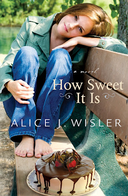
Here is part of the fascinating process of publishing! Bethany have recently changed their cover and synopsis for Alice J Wisler’s May release, How Sweet It Is.
Here’s the original:~
 Deena Livingston leaves behind a broken romance and her chef job in Atlanta to spend time at her grandfather’s cabin in the mountains of North Carolina. But her grandfather has an odd request: he wants Deena to teach cooking classes to the ragtag group of middle-schoolers who attend the local afterschool program, The Center. Reluctantly, Deena agrees, but how is she supposed to convince these kids that cooking at home is better than eating at McDonalds?
And after all she went through in Atlanta, why is she attracted to Zack, the social worker at The Center? Can a Dr. Seuss-quoting plumber, a curly-haired basketball player, and a group of middle-schoolers change Deena’s outlook on life?
And here is the most recent from Bethany’s website:~
 When Deena Livingston moves into her grandfather’s cabin in the mountains of North Carolina, she plans to keep to herself, start a cake-decorating business, and recover from the heartbreak she left behind in Atlanta. But a special request from Grandpa Ernest compels her to interact with the Bryson City locals, who have some surprising stories to share with the new girl in town.
Can a Dr. Seuss-quoting plumber who shows up at the most unexpected times, a handsome social worker who seems to know exactly what Deena is thinking, and a classroom full of mischievous middle-school students teach Deena to once again embrace the sweet things in life?
Tell Rel
I’d love to hear your thoughts on which cover appeals to you more as well as your comments on the synopsis changes – do you think it has been changed for the better?
Why or why not?
Relz Reviewz Extras


February 6, 2009 at 8:54 pm
well my first thought is, why is she next to a cake and barefooted? it looks like she’s in a park or at a lake. so if she’s in either place with no shoes on, her feet must be dirty. i don’t want that cake!all kidding aside, i prefer the 1st cover b/c i don’t like seeing the character’s image on a cover. i’d rather imagine them in my head than have the picture already out there for me.i like the first synopsis better too. i liked the mcdonalds quote.but it doesn’t matter to me regardless b/c i’m going to read the book no matter what 🙂
February 6, 2009 at 9:54 pm
I think I’d like a mix of the covers – I like the cake on the bench thing, but I think the character should have her back facing the front of the cover with a little bit wider shot. (I’m with you on the feet next to the cake, Deborah. YUK!)As far as the blurb, I’d take the first paragraph of the first one, and put it with the last paragraph of the last one.There’s my 2¢ – I ain’t hard to please, am I? *g* Looking forward to this one.
February 7, 2009 at 12:25 am
I like the first one better too, kinda draws you in and makes you want to see what that book could be about. I would read the back cover if I saw that in the book store. The other looks like a YA book cover to me. But hey I guess I am getting old!!
February 7, 2009 at 12:37 am
I immediately wanted to read it after reading the first synopsis – the second one sounded too sappy to me. Remind me not to be sappy in my reviews, someone. lolI like the first cover, too – the colors make it pop and I like that you have to use your imagination with the character. Interesting post! 🙂
February 7, 2009 at 12:46 am
Um, I don’t like either cover, and I think the foot thing is a problem. Plus, the second cover almost looks like a non-fiction cover to me. I also think it’s interesting that the back cover copy asks questions since agents/editors caution against pitching novels with questions. These questions are too leading and not very enticing.I could probably find the first cover more appealing if they dropped the militant posture and orange dress. Doesn’t fit the “sound” of the character.I haven’t liked several of the BH covers lately.
February 7, 2009 at 4:04 am
I’m with the majority that I much prefer the first cover, and the synopsis too. I’d pick that book up before the other. Either way, sounds like a great book to read!!
February 7, 2009 at 8:13 pm
The first one all the way is vastly more appealing. Like Deborah, I don’t like to see the character on the cover.
February 8, 2009 at 6:59 am
I guess I’m the weird one. I love the second cover. =}
February 8, 2009 at 4:20 pm
I never did like the first cover, but I do like the second! The girl/woman seems like someone I want to know more about. What’s her story? She seems innocent, yet I know she’ll be facing trouble. I want to know how she gets out.
February 9, 2009 at 11:01 pm
Wow, this has been really interesting! Thanks so much for sharing your thoughts. I actually prefer the second cover – maybe I am distracted by the cake LOL! To me the first cover is too Little Red Riding Hood and the woman looks like a little girl which doesn’t fit with the blurb. Although, in the second one the model looks very young, I admit 🙂I don’t mind the character’s face on the cover but I know many people don’t as evidenced by a lot of the comments here 🙂Thanks again.
February 18, 2009 at 9:26 am
I know I’m a bit late with my comment but thought I’d throw it in anyway… (I’m just catching up on my blog feeds.)
I prefer the second cover. I tend not to actually visualise a character when I’m reading a book. I’m not a “visual” person. I can’t tell you how I imagine someone to look. To be honest, I didn’t even notice the feet until I read the other comments.
The first cover looks “old” to me with the clothes and general layout. It reminds me of the modern editions of Dickens, Lord of the Rings etc that are mass produced in series to entice younger readers back into it. The second cover seems more whimsical. And drifting off into “unreality” is what I like about reading. It’s my escape.
I prefer the second synopsis too. It keeps the mystery of the “special request” at least and I’d rather read about a “handsome social worker” than a “curly-haired basketball player”. The McDonalds quote sentence in the first one seems “cheesy” for want of a better word.
Well, now that I’ve had my say – so long after the original post – I’ll leave you to it. 🙂
March 3, 2009 at 5:00 am
I preferred the 1st one, but I’m still getting a kick out of the main character’s name:0)