The Top Ten Tuesday topic – hosted by That Artsy Reader Girl – didn’t quite work for me this week – cover redesigns – so I’m tweaking it to my advantage and talking about some stunning covers that don’t feature people. While there are some very attractive characters on covers at the moment (I’m waving hello to Knox, Tate, Ford, and all of Ronie Kendig‘s recent covers!), I’m becoming more drawn to covers that leave the characters to the imagination and focus on stunning artwork or scenery.
I just love covers that evoke a sense of the story from a minimalist approach that leaves you pondering the contents, while hinting at what’s inside!
Here’s twelve (because that fits better on my page!!) for you to enjoy!
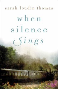
When Silence Sings by Sarah Loudin Thomas
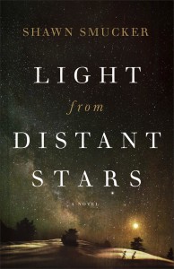
Light from Distant Stars by Shawn Smucker
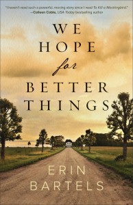
We Hope for Better Things by Erin Bartels
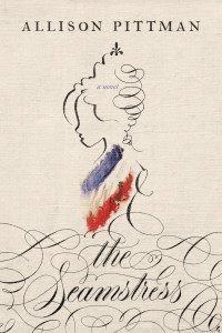
The Seamstress by Allison Pittman
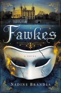
Fawkes by Nadine Brandes
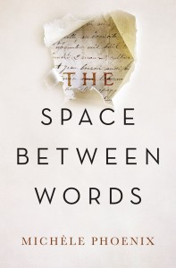
The Space Between Words by Michele Phoenix
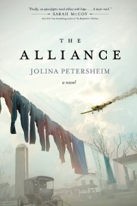
The Alliance by Jolina Petersheim
Lake Season by Denise Hunter
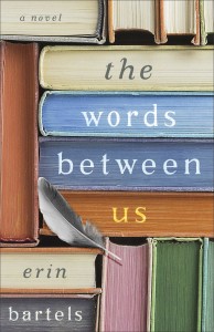
The Words Between Us by Erin Bartels
The Whys Have It by Amy Matayo
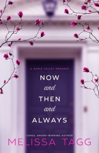
Now and Then and Always by Melissa Tagg
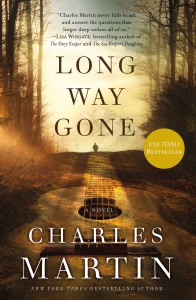
Long Way Gone by Charles Martin
I guess I have a thing for guitars and I know Amy’s does have a character on her cover if we want to get technical, but he gets a pass because I adore the cover so much and we can’t see his face!
Do you prefer characters or artwork/scenery on book covers?










August 7, 2019 at 8:44 pm
All of these books have such pretty covers. I prefer it when covers don’t show people, too. To echo what you said, getting to imagine them yourself is more fun. 🙂
My TTT.
August 8, 2019 at 1:51 am
A pretty cover is a pretty cover. I love the variety going on in the cover market. Typically I enjoy seeing a person, but I can definitely appreciate what turns out to be a beautiful piece of art!
August 8, 2019 at 11:58 pm
These are so pretty! I loved The Space Between Words and of course I love Charles Martin’s novels, especially Long Way Gone!
August 9, 2019 at 11:49 am
Oh BINGO!! I much prefer a scenery cover – – Charles Martin’s cover of “Long Way Gone” is a perfect example of the cover provoking interest – imagination putting a face on the characters – and the story making it all come together. Another example is Francine Rivers cover for “The Masterpiece” – and another is the original cover for “5 Days in Skye”. There are some covers that the cover characters really match the story – such as Tamara Leigh’s Age of Faith Series. But by and large, I really prefer a scene that teases me into wanting to know what the story is about.
August 9, 2019 at 11:52 pm
I like covers with or without people. Of the ones shown, I especially love The Words Between Us. Lovely cover! Can’t wait to read it.