 Cover Art! Such a fun topic, isn’t it? I love sharing new covers and reading your responses to it. Eye-catching covers are pivotal to an author’s exposure, and everyone will have a different view on what appeals to them. I feel for the publishers and designers trying to come up with a cover that best reflects the story AND will hopefully appeal to the majority of readers.
I’d love your feedback the kinds of covers you prefer, stylistically. Ones with models, scenery, illustrations, framed, textured, etc. Here’s some covers to consider – which one catches your eye the most, and why? And try not to think about author or publisher, or even genre – try to just see the covers themselves!
NB. If you click on the cover, you will get an enlarged view.
*******
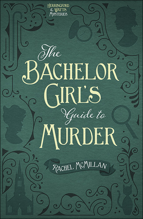
The Bachelor Girl’s Guide to Murder
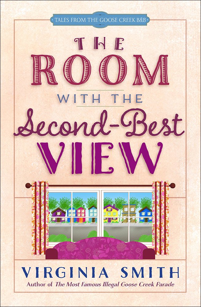
The Room with the Second-Best View
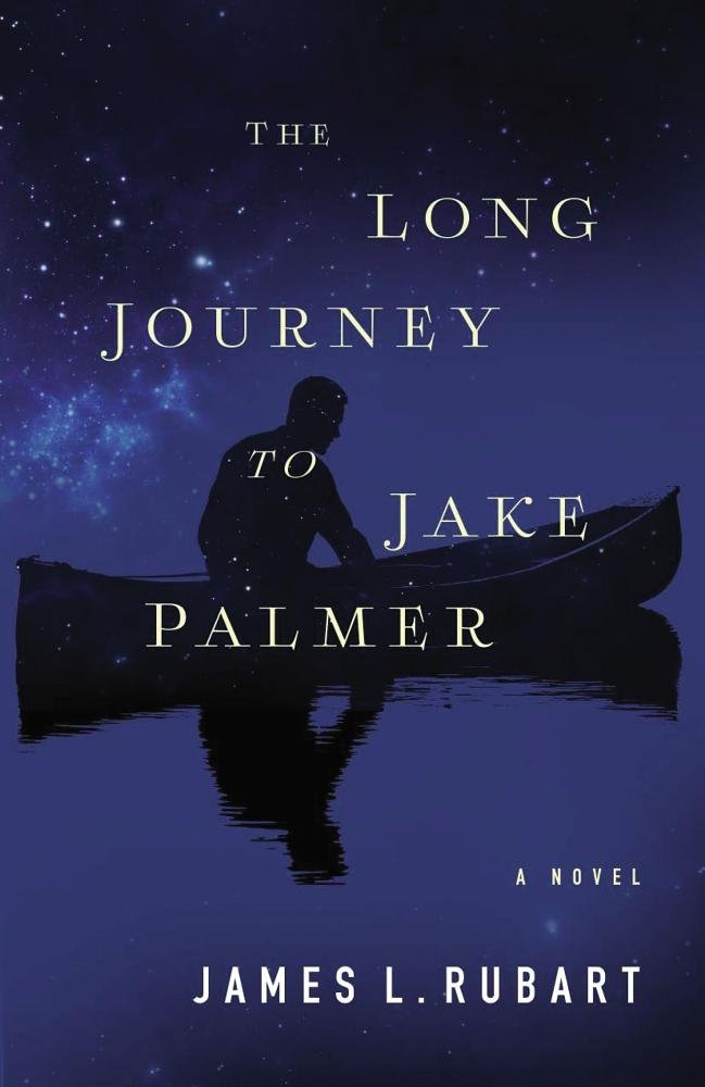
The Long Journey to Jake Palmer











February 16, 2016 at 10:21 am
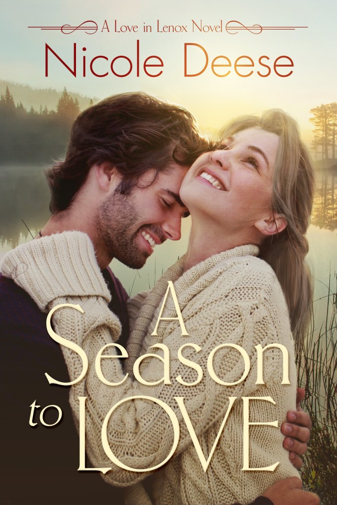
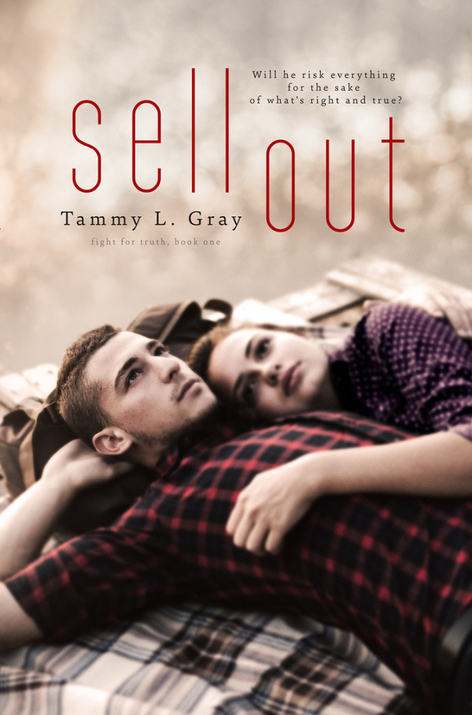
I love the ones with the models on the front. I mean, for real, look how cute the guy is on the cover of Nicole’s book. Wowzer! I love the couple on Tammy Gray’s book. Once you read the book you know why that cover is the way it is. He seems to be in such deep thought.It also helps me to get a visual on what the author had in mind when she was writing the book. I love all of these covers really. I think they are getting better and better each year.
February 16, 2016 at 2:19 pm
I love it when you can look back on the cover after reading a book and see all the links to the story. A little bit like Easter eggs, Dana 🙂
February 16, 2016 at 11:12 am
Which ONE??
Uhhh, hmmmm…
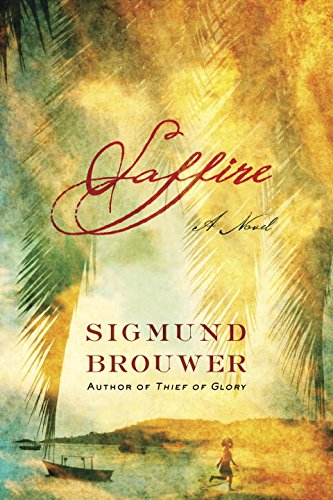
My favouriteS include Dottie’s, Tamara’s, Joanne’s…Brouwer’s is beautiful…Rubart’s is very appealing… and Jolina Petershiem’s draws me IN!!
February 16, 2016 at 2:19 pm
Yes, yes, yes! Thanks for dropping by, lovely one xo
February 16, 2016 at 11:35 am
It depends–I expect different things from different genres. I do like it to feel inviting…if that makes sense. My very fave is Brouwer’s cover. WOW! I literally want to read it from one look.
Really, I want the cover to be like a work of art. I don’t care for covers that look too “played with”, or too “photoshopped”. I think most of the covers you shared reflect the best of their genre. Though I will say Camden’s isn’t really my style and Smith’s doesn’t really appeal to me either. Just my taste. Such a fun topic, thanks Rel!
February 16, 2016 at 2:21 pm
Hey Amber – I think Virginia’s is great for the genre (even though I said we wouldn’t talk about that!) but it’s not my favoured style either.
February 16, 2016 at 11:47 am
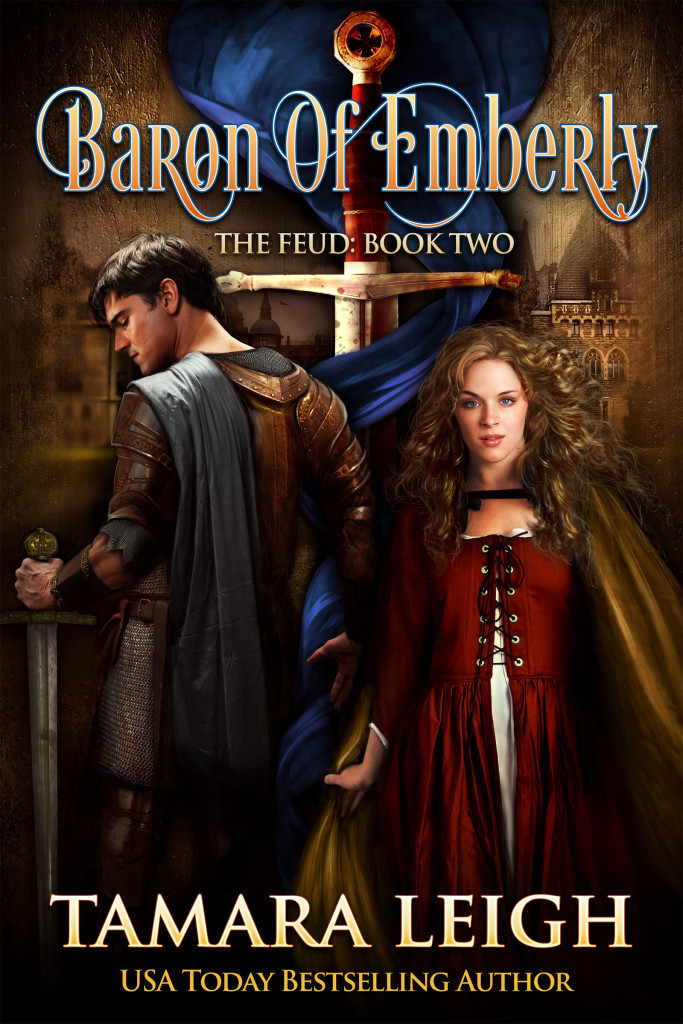
I heart so many of these – Ronie’s is just perfect because I “know” her caliber of story. They’re always about heroic, noble, upstanding men (who are still flawed) doing good things and these male model covers do an excellent job portraying this. I also really like Nicole’s and Denise’s because they are sweet and romance-y which is how I picture the stories being. Also Joanne’s is colorful and perfectly indicative of what her story is, and Rachel’s = PERFECTION! I adore the silhouette’s and the whimsical details. 🙂
Fun reading, Rel. I’m putting together a cover design article for one of my contributing jobs, and had such fun getting in touch with some designers for a behind-the-scenes look at how everything comes together! 🙂
February 16, 2016 at 2:23 pm
It’s amazing, isn’t it, Rissi? I’m always conscious of when we talk covers, especially ones we don’t like, that so much work has still gone into it’s creation, there have been long hours of thought and consideration as well.
February 16, 2016 at 12:00 pm
I love covers too! Maybe that’s why I’ve always been so particular about making sure they never get creased. And I am sooooo guilty of judging books by their covers. But I don’t think I have a particular style preference. It really depends on the genre and the tone of the book. Ronie’s covers are great (both of them), and getting better with each one, and Sigmund Brouwer’s book really caught my eye (but it’s also one of the only ones I haven’t seen before). I love Nicole’s cover, but I’ve read the book and loved it, so I can’t view that cover objectively any more! Really, I just love covers!
February 16, 2016 at 2:23 pm
I agree that once we have read a book, we can look at the cover differently and be a little biased! Thanks for sharing 🙂
February 16, 2016 at 12:28 pm
Hey Rel,
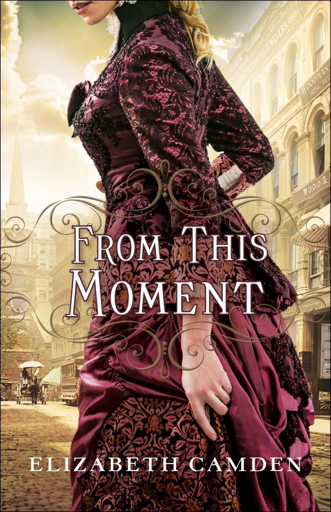
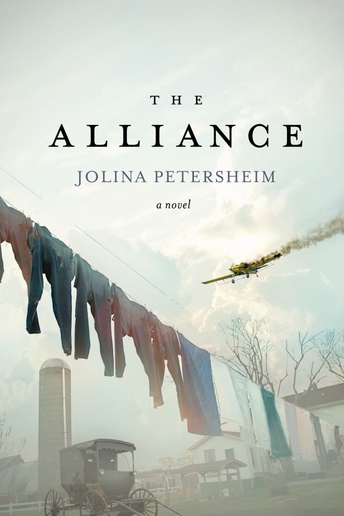
Well, I know you know many of my likes and dislikes in covers already. I prefer people on the cover as they give me something to easily relate to and a sense of life and warmth, even if it is a winter scene. Also, you can usually tell immediately the type of story, including the time period which is tantamount to this historical lover, if there are people on the cover. You asked us to forget everything except the cover itself. (You sound like a literature professor I had who thought nothing should be considered, including the author, when studying a story. I had trouble with that class, too. 🙂 ) It is hard for me as the cover should be used to identify so many of the things you mentioned. Genre is my primary factor in choosing a book, and if I don’t already know, the cover points me in the direction of the type of book I am looking for. With that said, just looking at these covers, I actually love most of them. There are a couple I am not as fond of. I LOVE Ronie’s suspense cover, but I am not a fan of her fantasy cover. (Sorry, Ronie.) Because she wrote it, as a lover of fantasy I am certain I will love it, but if I was not familiar with the author, I would not chose this one. It is just too nondescript for me. I am not fond of Joanne Bischof’s cover here. I like the shoes on tiptoes showing she (I am assuming female, although you can’t really tell for sure) is reaching upward “to get to you,” but you cannot tell the age of the characters. I assume teenagers because of the shoes, but it could be adults, too. I am not a fan of this cover of Sigmund Brouwer’s. I do not like the title font at all. It is too hard to read at a glance. Also, you can tell nothing of the type of book from the cover. As he writes so many types of books, the reader would have to depend solely on the back cover copy or any synopsis to know what the book is about. In my opinion this makes it easy to pass over in favor of one you can tell about quickly. I also am not too fond of this cover of Virginia Smith’s. While I confess the topic would probably primarily interest women, a story about a town with quirky characters could appeal to some men. The color of this cover could negate that, however. It is also very nondescript to me and too similar to the other covers of the titles in this series. Which brings me to Rachel McMillan’s cover… As just a cover, I love it. It is different. It reminds me of those old leather bound covers of yesteryear. However, again it is too similar to the other titles in the series. (I am including the e-book prequel.) The only major difference is the color. Most customers in a store won’t look closely enough at the few different symbols to note a different book. The reader would have to know according to the color or title, which is not a sure thing if one is looking on a shelf for a new title in a series. And of course, there are the decapitations… Oh, the horror! 🙂 I am definitely not a fan of the majority of the decapitation covers. I think the trend may have started in the secular market with a series set in the Victorian era targeting teen readers. I believe, not certain, that it was done to be a bit different and to especially highlight the extravagant gowns worn by the cover models. The first Christian title of this sort I remember was Bethany House’s “A Bride Most Begrudging” by Deeanne Gist. This cover worked brilliantly as it showcased the dress but especially highlighted the “bride’s” crossed fingers behind her back. This immediately alerted the reader that this was a historical with a touch of humor and whimsy. As some of these books with these covers sold well, publishers began to use this technique for no other reason than to use it. I think it works well when there is something else to spotlight, but in my opinion a decapitation does not work in any way when it is just done to be done. The one here by Elizabeth Camden works ok to me as the beautiful dress is showcased, but it still would be if the face were shone as the dress is that spectacular, so it is not effective to me. As for just working as covers, I think Ronie’s suspense cover works better than most as it reveals the genre while appealing to women and men. I will add I do like some covers without people and I think “The Alliance” is a brilliant cover. It reveals a literary type story and showcases the juxtapositions of two worlds, Amish and not Amish, colliding through a downed plane. Thanks, Rel. As you know this is a favorite topic of mine, and I do tend to go on. But much of it comes from years of working in a Christian bookstore and watching responses to fictions covers by customers. Thanks for providing a place for the discussion. Have a good one! And let me say finally that while I may not like a few of the covers here, I am familiar with almost all of these authors, and I am certain a reader could not go wrong with any of these wonderful stories!
February 16, 2016 at 2:36 pm
Thanks Aaron – you are always generous with sharing what’s on your mind about covers! It adds so much to the discussion.
Funny how you mentioned you like to know immediately what the story is about from the cover. While I don’t disagree, I love finding covers that aren’t super clear – it actually intrigues me and makes me what to read the synopsis to find out more.
Similarly, with Rachel’s cover. I love that they are themed and the differing colours are the main identifying factor. It makes it fun to discover the different symbols they have used with each book. Again, something that intrigues me rather than puts me off 🙂
And decapitations – I know they are a sore point (hehe!) and I don[‘t mind if they are well done, as you say.
February 17, 2016 at 8:29 am
I think it is just hard for me to turn off the bookstore person and the editor as I have been fortunate to be in on discussions on planning covers for the books. I read that someone mentioned the words and fonts. I’m sure that most people know this, but you can usually tell the main selling points of a novel by the parts that get the larger font sizes. A best-selling author’s name is usually a highlight on his or her books. But the title might be on lesser known authors. Also, publishing houses tend to have preferences, also. Those who favor people covers tend to be mimicking what Bethany began for the Christian market many years ago and those who prefer other types are at times mimicking current trends in the secular market to attempt to target the titles in that direction. I have also noticed that some bigger name authors as they are sometimes referred to have less busy covers at times so as not to detract from the name recognition factor. Oh, and there is also the concept of covers for series. Some houses definitely consider the potential series when designing the first cover, meaning can other similar covers be done that are not strict copies as to confuse but recognizable as belonging in a particular series. And Rel, avid readers like you and your wonderful following here would tend toward different covers at times as they read and see so much. Also, I would guess you love actually browsing for books to find the “treasures.” As you know, bookstores have to be concerned with those who do not take the time to truly browse as they may be getting a gift or just looking for a “summer beach” read.
February 17, 2016 at 1:50 am
No harm or insult taken, Aaron. The cover was exactly what I and my publisher wanted. My cover is typical of several speculative authors, including GRR Martin, Ted Dekker, Veronica Roth’s series, the Hunger Games series, Pierce Brown, and Lawhead. Also, our own Jill Williamson. I specifically requested to focus on the sigils because that tells the evolution of the main character. I did NOT want a fantasy-esque “painting” on this cover.
February 16, 2016 at 12:45 pm
A cover can definitely draw me in or turn me away. Covers with characters instead of actual people are the worst. I’m fine with covers with no people, such as Thin Ice, but if there are people, let’s make them real ones. I rarely read summaries because they give too much away. Seriously, I just read a book that gave away what happened in the entire book in the four sentence summary (I read the summary after reading the book). Perhaps some readers like that much detail, but not me (Relz, this could be a topic for another Wednesday – book summaries). I digress…Back to topic…
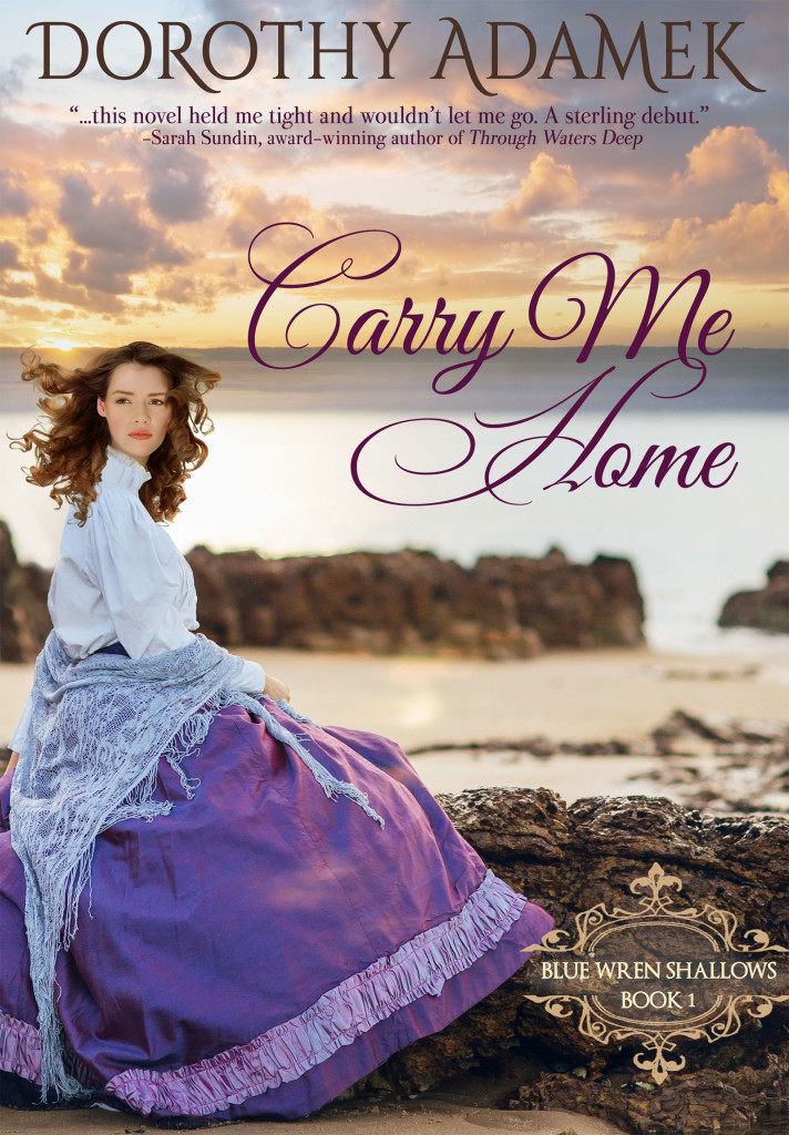
I love the cover of Carry Me Home. I had no idea what the book was about, but read it because I loved the cover and Relz endorsed it. Love the lighting in Nicole’s cover..one I will likely read because I like the cover. The covers of The Alliance and Sell Out speak to me as well.
February 16, 2016 at 2:37 pm
Hi Staci – love your thoughts on this. Good idea to talk about synopses, too!
February 16, 2016 at 12:57 pm
So many pretty covers here! I really like Ronie Kendig’s, Elizabeth Camden’s, Denise Hunter’s, and Nicole Deese’s covers. Even if I wasn’t already familiar with the authors’ writing, the covers would entice me to find out more about them. The two covers that just jump out at me in this list, though, and are my favorites are Pepper Basham’s and Ruth Logan Herne’s. I just really like the look of them. Pepper’s makes me think of a really good Hallmark movie, and Ruth’s… it’s a cowboy. I love cowboys! 🙂
February 16, 2016 at 2:38 pm
Americans and their cowboys!! Thanks so much for sharing your thoughts, Clari – appreciate it 🙂
February 17, 2016 at 8:53 pm
Clari, there is something about a man in uniform…. or a cowboy.
I don’t need to analyze it, we women are odd creatures in men’s eyes, but I think it’s the established code of honor we associate with them. I love that they put the horse… “Yesterday’s News”… on the cover, too. And how tender Colt looks, handling him. Thank you for your kind words!!!
February 16, 2016 at 2:56 pm
Hi Rel –
What a fun topic, especially since I’ve recently finished the cover of my next book. For me, I do not like cutesy, sketches, or cartoonish covers. But, I also don’t like books that use words like: Romp, quirky, or cozy in their descriptions. It’s just not a genre I enjoy. I like grit, edge, realism. I like books with models on the cover because I want to get invested with the characters. While I am reading, I will glance back at the cover to make sure it matches up with the character description. I don’t mind covers with objects on it like THIN ICE but that might be because I am judging the cover on the author’s name. Can’t wait to read some of these books. 🙂
February 16, 2016 at 5:03 pm
Hi Tamara – thanks for sharing. I value your thoughts. So with you on wanting the descriptions in the book to match the cover art. Liz Curtis Higg’s Grace in Thine Eyes is one I remember as the book described the brocade jacket the cover model was wearing perfectly. Although, I suppose it was really the other way around 🙂
February 16, 2016 at 2:58 pm
I know you said not to look at genre, but that’s impossible. I flicked straight past two perfectly good covers because they are genres I don’t read.
I also can’t ignore the author names, especially when some authors have cover design that typifies their novels so well (thinking of the DiAnn Mills and Joanne Bischof covers in particular).
These are all excellent covers, and all have a couple of things in common: the cover clearly shows the genre, and the covers aren’t over-complicated. Most use only a couple of fonts and one or two pictures. Keep it simple, and grab the attention of your target reader.
Sigh. As if my to-read pile wasn’t high enough.
February 16, 2016 at 6:19 pm
I didn’t say it would be easy 😉
Happy reading…xo
February 16, 2016 at 6:24 pm
I think The Alliance might be my favorite of all of these. There’s so much story on that cover!
February 17, 2016 at 12:12 am
Oh man…this is one of my favorite things to think about!!! I think being a photographer and (novice) graphic designer I tend to be more critical on covers. I expect a lot and I expect it to be well done. I have a soft spot for anything Kirk DouPonce designs and I think Embers is one of my favorites, but I also was really struck by James Rubart’s cover here for “The Long Journey to Take Palmer”. Something about the simplicity, mystery, and design of it all appeals to me. I don’t tend to like models on the cover (Ronie’s books are an exception) because I would rather formulate who the characters are from the book itself. Yet, the genre really starts to dictate what your cover looks like which, in the case of romantic suspense (which I write) you’ll likely have models on the cover…
February 17, 2016 at 8:09 am
Jim’s is gorgeous, isn’t it, Emilie – thanks for sharing from your photographer’s wisdom. I sure you must notice things the rest of us don’t! Hope to be reading your book someday soon!
February 18, 2016 at 3:15 am
Oooo I hope so too Rel 😀
February 17, 2016 at 1:05 am
I am so glad you included covers with this question. I know what I like, but sometimes have a difficult time articulating why. Most of the covers I like have a couple of things in common. — simple images combined with the titles front and center. I think words capture my imagination more than the images. Not sure what that says, but it’s what first grabs my attention. Rachel McMillan and James Rubart’s covers are my favorites of this bunch.
February 17, 2016 at 8:10 am
That’s really interesting, Beckie – words capturing you more than images. I like that 🙂 Does that mean the font is important to you as well?
February 17, 2016 at 10:55 am
Font type, size and placement are important. I prefer less when it comes to images. Too much going on is overwhelming. But … a book cover that doesn’t appeal won’t keep me from buying it. I don’t judge. LOL!
February 17, 2016 at 1:14 am
I prefer a heroine and/or hero (romance-wise) on a cover and for the elements to reflect the time period and tone of the story. I find all of these covers appealing in their own way, but of the covers that don’t feature a peek at the hero/heroine, I’m especially drawn to Rachel McMillan’s. It’s simply unique.
February 17, 2016 at 8:11 am
Go figure, dear Tam, on preferring the protagonists on the cover 😉 Your covers are always so eye-catching…just like the words within!
February 17, 2016 at 8:44 am
Yeah, go figure 🙂 Thank you, dear Rel!
February 17, 2016 at 8:18 am
I just wanted to say I was so happy to see your series come out in paperbacks. They are now at home safely ensconced in my TBR pile!
February 17, 2016 at 8:46 am
I’m sorry it took so long to release them in paperback. Many thanks for bearing with me. Honored they’re in your TBR pile 🙂
February 17, 2016 at 1:53 am
Of course, I’m quite partial to my covers, especially the brand-spanking new Conspiracy cover. *beatstillmybeatingheart*
But I also love Dorothy’s, which is quite striking with the skirt against the rock. And Jim’s–wow, I almost didn’t even realize that was his. Can’t wait!! I adore Elizabeth Camden’s, even though I don’t read that genre. And I like Rachel’s because it reminds me of classic novels, which makes you automatically think you SHOULD read it (shouldn’t we all be reading the classics?).
February 17, 2016 at 8:12 am
Love your final line, Ronie – yes, we should! Conspiracy is just fabulous. SO much cover love for that one 🙂 Thanks for sharing your thoughts xo
February 17, 2016 at 2:08 am
I’m definitely NOT a headshot person. I prefer not to see faces at all (or to see only partial faces), since I hate it when they don’t match what I see in my head. Thus the ones the stand out to me most are Rachel McMillan’s (quirky), Ronie Kendig’s (bold and striking), Sigmund Brouwer’s (soothing), and Elizabeth Camden’s (decadent, like cheesecake [gorgeous, but I’m not sure I could handle too many covers like it]). But there are exceptions to every rule: Dorothy Adamek’s, which clearly shows a face, is simply beautiful, and Nicole Deese’s is even closer-up, yet it radiates such warmth and joy that I do really like it.
February 17, 2016 at 2:09 am
I should specify, Ronie Kendig’s EMBERS (as glancing back I see there are two by her!)
February 17, 2016 at 8:13 am
Yes, you are so right about covers exuding emotions, Rachael – love that!
February 17, 2016 at 3:44 am
Yeah..covers!! For romance novels I prefer to have the characters on the front since I like to see if the models are a good representation of the character descriptions. I, too find myself flipping back and forth while reading the book to keep them in my mind’s eye. For this reason I really like Tamara and Denise’s covers. And because I’m a female with a pulse…I adore Ronie’s (Conspiracy of Silence) and Ruth’s covers. Honestly, the inside could be a phone book and I would buy these books for the covers alone :-). However, for uniqueness that would peak my interest I really like Jolina and Rachel’s. The one that didn’t appeal to me at all was Virginia’s. I’ve never read anything by this author, but the cover is too generic looking. I need something to snag my attention and this failed to do so. A couch facing a window doesn’t make me want to pick it up and see what story lies inside. Guess I’m truly judging the book by it’s cover. Thanks for the question, Rel.
February 17, 2016 at 9:15 am
Great thoughts, Amy – you made me laugh, too…any female with a pulse!!!
February 17, 2016 at 1:07 pm
Amy,
“because I’m a female with a pulse…I adore…” HILARIOUS!
February 17, 2016 at 8:50 pm
Hahahahahahah! “any female with a pulse…” Laughing at the truth in that! You know I’ve been blessed to write and publish a lot of books to date, but when Waterbrook gave me the chance to come on board with this cowboy series, I was ecstatic! And they have rocked the covers, I just got a sneak peak at #2 (coming this fall) and…. oh, be still my heart! Amy, thank you!!!!! Still laughing and agreeing!
February 17, 2016 at 4:20 am
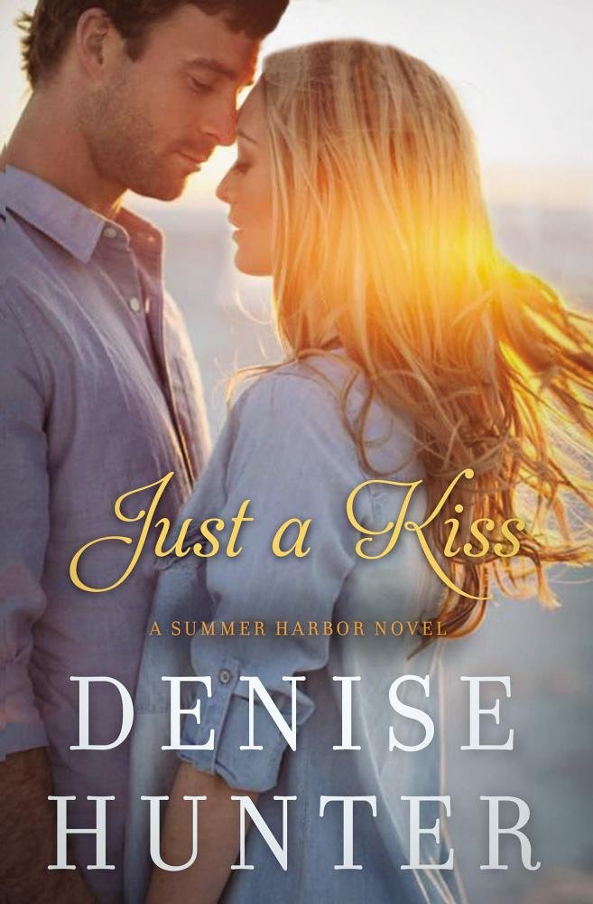
I love the covers…they reflect the genre and all grab my attention in certain ways. I think those who are drawn to particular authors are grabbed by certain looks in a book. I personally LOVE Conspiracy is Silence by Ronie Kendig as it feels very Jason Bourne, intrigue, adventure…and seriously who can say know to that intensity! Not me…it’s on my preorder list, that’s for sure. I also love the “Just a Kiss” cover dy Denise Hunter…their portrait just makes me want to feel their love story and to know more about them. Tamara Leigh’s coved drew me right in…the couple looks so interesting, I just want to know more! “Embers” speaks to me…I want to know what the symbols mean. it’s so different, I want to know what’s behind the cover. My fav books are romance/suspense..so DiAnn Mills story grabs my attention, too. And…who can say no to horses & cowboys ..that imagery draws me in, too.Honestly, I would read any of these if they were given to me, but, I live books 🙂
February 17, 2016 at 8:50 am
Aww, thanks, Denise! After poring over hundreds and hundreds of models, I picked those two–a perfect fit for Magnus and Thomasin 🙂
February 17, 2016 at 9:16 am
I’m so enjoying everyone’s comments on this subject, Denise – thanks for sharing yours. It’s always so interesting to know why certain covers appeal to certain people.
February 17, 2016 at 8:55 pm
Denise, I like how you think! Who can say no to horses and cowboys, LOL! Thank you, sweet thing!
February 17, 2016 at 4:45 am
I feel like I may be in the minority here, but I usually don’t go for books with people on the cover! They often look too daytime drama for me. The exceptions are the ones with a little mystery attached, like Conspiracy of Silence (I have to consider the author for a moment just to say I like her new covers better than the older ones. They have more grit and reality.), Carry Me Home, and From This Moment. But I am not usually a fan of romance novels anyways, and they usually have smiling couples on the cover. I like when the romance is intertwined with action, sci-fi, fantasy or mystery. My favorite covers here are Embers, the Bachelor Girl’s Guide to Murder, The Long Journey to Jake Palmer, and The Alliance. All so different, and yet they catch my eye immediately!
February 17, 2016 at 9:21 am
You are not alone, Jodi! I’m with you on having models on covers – it’s a risky venture. They can look overdone and they don’t often reflect the story.
You mentioned Ronie’s covers – I’ve adored every story of hers but thinking back to the Nightshade cover, the model on the front was way too young and ‘nice’ looking to truly reflect her Max. You are so right that her current covers are much more reflective of the characters and story!
Thanks for sharing 🙂
February 18, 2016 at 4:46 am
I like to imagine the characters I am reading on my own. So, I often prefer books without people, too! Or, people in shadow — or (LOL) headless. I really like the Camden!
One of the surefire ways I can tell that a book is pubbed and marketed to the CBA is if it DOES feature a person on the cover. With that in mind, my agent and I had a conversation with my publisher Harvest House about keeping people off the cover in order to help its crossover potential with the general market.
I find, however, that my cover tastes differ from genre to genre.
🙂
February 18, 2016 at 8:59 am
There is an inordinate amount of people on covers for the CBA, for sure! Thanks for dropping by, Rach xo
February 17, 2016 at 7:41 am
Wow… so many different reasons readers are pulled to or turned off a book cover! I’ve learned lots from this post. Thank you, Rel.
I have been known to pick up a book on the cover alone. Even before I know the author’s name or book title, a cover can sway me all the way to the checkout.
I LOVE Jolina’s cover. Catches my eye straight away.
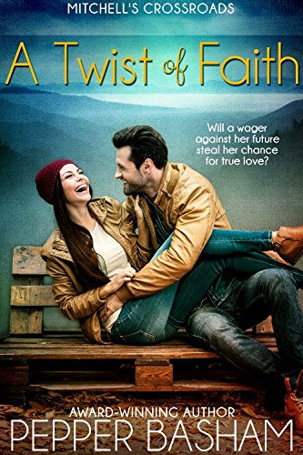
The striking colours in Tamara’s books always leap out at me, as do the colours in Pepper’s, A Twist Of Faith.
And thanks to this post, I now have even more books I want to read based on a colour-crush. Go figure… 😉
February 17, 2016 at 9:22 am
Hey Dorothy – always happy to add to your TBR pile 😉 Good to see Carry Me Home getting some cover love!
February 17, 2016 at 8:07 am
I would have to say that “Carry Me Home” is my ultimate favorite. But I have read the book and the cover matches the story so beautifully, so that might affect my preference. Ronie Kendig’s covers always match the intensity of her characters. I love “Just a Kiss” and a “Twist of Faith” for contemporaries. And finally “From This Moment” really catches my eye for an historical. Beautiful covers coming up!
February 17, 2016 at 9:23 am
Yes, I think we fall in love with a cover even more after reading the story! Love hearing your thoughts, Rebecca.
February 17, 2016 at 9:31 am
All the covers caught my eye. I look at the covers first and then peek to see what is inside the book.
I love the cover of “Back in the Saddle” by Ruth Logan Herne. All I can say is, where do I go to sign up for horseback riding lessons?
February 17, 2016 at 9:40 am
Janet – you made me laugh!!!
February 17, 2016 at 8:47 pm
Janet, right???? Oh my stars, horseback riding lessons with Colt Stafford???? 🙂
I am loving reading these comments, they’re awesome, and when that book releases in a few weeks, I think we should all put on our ridin’ boots and meet up with Colt… and he has TWO BROTHERS…. Oh be still my heart!
February 17, 2016 at 9:37 am
Such a tough question!!! It’s hard for me to critique covers without considering genre because I have different expectations for different genres. I think the ones by Ronie, Rachel, Denise, and Pepper each fit their respective genres perfectly.
One that stands out to me (possibly because I haven’t seen it before) is James L. Rubart’s. It has a photographic and realistic quality to it that is intriguing.
Rachel’s, for instance, immediately indicates a classic style with the simple colors and stylized font. Yet it is still classy and unique in its own genre.
To me, font style is just as important as image design. I really like Elizabeth’s, Joanne’s, and Jolina’s for that reason. Another great example of font utilization is Susan May Warren’s Christiansen family series.
February 17, 2016 at 9:42 am
I was wondering when font would come up as really important to someone, Courtney 🙂 I agree it can make or break a cover because if it isn’t right it distracts from everything else.
And yes, it is next to impossible to view them without consideration of genre!
February 17, 2016 at 10:59 am
As someone investigating the elements of cover design for my debut novel I’ve found this discussion very interesting and helpful – thank you! I like my historicals, so ‘From this Moment’ is the most appealing to me, plus I love the colour and mystery hinted by the cover of ‘Carry Me Home’. I like seeing models that match the physical descriptions in books (seriously, how can they ever not?), but I also like not seeing faces, as it provides more ‘scope for the imagination’. Sometimes faces can be photographed in a way that holds a hint of something (smugness?) that makes me not want to like the character. I agree with the comment about Susan May Warren’s Christiansen family series – love the font of those, and Becky Wade’s covers too.
February 17, 2016 at 11:44 am
I really love the covers with people on them, but this is probably because I love reading sweet romance, amongst other genres. I think really it does depend upon which genre the book is representing. Something fresh and original usually gets me in.
February 18, 2016 at 9:00 am
I’m with you on being attracted to fresh and original, Josephine-Anne 🙂
February 17, 2016 at 12:50 pm
Oh my goodness, Denise’s cover is lovely! And Ruthy’s. Wow! How do you even pick one!
Rachel’s is perfect for her novel. Classy and intriguing.
How FUN!
February 18, 2016 at 9:00 am
Yes 🙂
February 17, 2016 at 2:25 pm
Carry Me Home (romantic, ethereal)
From This Moment (transports me to that time period)
The Room With the Second-Best View (charming; I also like the tongue-in-cheek title)
Just A Kiss (sun in her hair)
The Long Journey (stars, blue, moody)
Back In The Saddle (Can’t go wrong with a manly man)
Alliance (contrast between peace and war; mundane and extraordinary; old ways versus technology)
A book cover doesn’t influence my purchasing decision, but I can appreciate a great cover.
February 17, 2016 at 9:03 pm
Cherie, thank you! Kelly Howard of Waterbrook is doing my covers, and she has such a wonderful vision for cover = genre…. truly a gift to see the story in the cover she’s designing, whether it’s for me, Cindy Woodsmall, Kim Sawyer, Jody Hedlund, etc. What a great artistic eye she has… and she picks GREAT COWBOYS, TOO!!!!
*And a great horse! 🙂
February 18, 2016 at 9:01 am
Loved this, Cherie – thanks for sharing your insights!
February 17, 2016 at 8:06 pm
Oh so many eye-catchers here. But being a historical reader and author I give my vote to Nicole’s joyful cover and Dorothy’s dreamy one. If only Elizabeth Camden’s heroine did have her dainty head lopped off!
February 17, 2016 at 8:08 pm
Uh-oh. Jumpy finger here.I meant the poor girl’s head shouldn’t have been chopped off.
February 18, 2016 at 9:02 am
LOL! I knew what you meant, Rita 🙂 Appreciate your thoughts.
February 17, 2016 at 9:09 pm
I have to say this is a wonderful discussion, and I think you guys are spot on, it is hard to separate the cover from a genre you may or may not like, so putting that aside, The Assigned is mind-grabbing to me. Absolutely sent my mind spinning in several directions at once, and now I have no choice but to read it.
These are all gorgeous covers, and solidly true to genre, but as a romance lover, Pepper’s and Dorothy’s don’t just appeal to me, they jump out, grab me by the heart and say “Buy me. Read me. Now.” And so as a romance reader, those two did the exact job they were supposed to do!
To be fair, I read Pepper’s story in contests, and then as a buddy and loved the framework of it, so to see it in print is a thrill for me. But other than knowing Dorothy on facebook, I’ve got no ties to that book, and it grabbed hold right away.
I love stories of women overcoming whatever life sends them, and that’s what I sense in Dorothy’s cover. A woman, doing what it takes to get the job done. Wonderful!
February 18, 2016 at 9:03 am
Great thoughts, Ruthy – looking forward to reading your new novel. I think the cover will hook many a reader 😉