
- stock.xchang
One of the most fascinating parts in the publishing process is the creation of a great cover. It’s no doubt challenging for the publisher to ensure a book has an eye catching cover that also reflects the story accurately. As we know from my many cover previews sometimes they achieve that goal and then some, while at other times the mark is missed.
On rare occasions, you will see a cover change from the original one presented on Amazon and the publisher’s website where no doubt feedback from the author, the public or internal information leads to the cover being altered – sometimes just a tweak here or there, other times a completely new design.
In recent years, I’ve seen a change of covers for Alice Wisler’s How Sweet It Is, Dale Cramer’s The Captive Heart, Michael K Reynolds’ The Flight of the Earls and more.
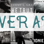
This time it’s Richard Mabry’s April, 2013 release, Stress Test, receiving a makeover – a completely different look from what is currently up at Amazon. I’d love your thoughts.
Here’s the back cover copy to help you decide!
Stress Test
Dr. Matt Newman thought he was leaving his life in private practice for a better one in academic medicine. His kidnappers have no such plans for him. They just want him dead. Bound, in the trunk of his car, Matt’s only thought is escape. He does so, but at a price: a head injury that lands him in the ICU, where he awakens to find he’s charged with murder.
Sandra Murray is a fiery, redheaded lawyer who swore she was done with doctors, but the call from Matt presented a challenge she couldn’t turn down. She decided to give it one more chance.
Matt’s career is going down the drain. His freedom and perhaps his life may be next. Can he and Sandra uncover the truth before the kidnappers finish the job they started?
Initial design

Final design

Let’s talk ~ which cover do you prefer and why?
Relz Reviewz Extras
Q&A with Richard
Character spotlight on Dr Elena Gardner
Reviews of Code Blue and Medical Error
Character spotlight on Cathy & Will
Interview with Richard
Visit Richard’s website and blog
Preorder Stress Test at Amazon or Koorong


September 10, 2012 at 12:04 pm
Rel, Thanks for sharing this. The first cover was nice, the second captures the mood of the book. Glad the Thomas Nelson team kept an open mind and listened as opinions came in.
My experience in publishing is limited, but it’s my understanding that this happens, but not often. Happy it did this time. And I think they nailed it.
September 10, 2012 at 1:47 pm
Richard Mabry » Good to see you here, Doc! Yes, I think TN did well to revise it – not that the first was terrible, although orange really isn’t a colour I love! But I love that your protag is on the cover, especially as he is a man – it’s a nice change 🙂
September 10, 2012 at 12:15 pm
While as a nurse I like the first cover, the second cover has more of the gritty feel of the novel – or at least what the novel appears to be. The first one could have been any sort of novel or even a non-fiction, like someone going through med school, for example. I love Doc Mabry’s books – can’t wait to read this one!
September 10, 2012 at 1:45 pm
Mocha with Linda » Your comments are spot on, Linda.
September 10, 2012 at 12:16 pm
Wow! The second cover is awesome! Very atmospheric and intriguing. I’m looking forward to reading it.
September 10, 2012 at 1:44 pm
Rosslyn Elliott » Totally agree, Rosslyn – thanks for dropping by and sharing your thoughts.
September 10, 2012 at 12:50 pm
The final cover definitely elevates my heart rate more than the first one….love the intensity. =)
September 10, 2012 at 1:42 pm
Jenny » I’m with you, Jen – more personal and connects you more with the story.
September 10, 2012 at 2:47 pm
The orange one seems like the book is more medical, while the second one shows the dangers involved in the book. I like the first one better, but for the content of the book I would go with #2.
September 15, 2012 at 2:19 pm
Linda » Great thoughts, Linda – thanks
September 10, 2012 at 11:56 pm
The second. The first one is just boring, to be blunt. The second is much more eye-catching
September 15, 2012 at 2:18 pm
Mark » Yes, the second draws the eye, for sure
September 11, 2012 at 12:01 am
Agreed there was a change needed. I agree with Mark about the orange one being boring: it flat-lined. 😉 The second one is better, although I’m not sure I like the “portrait”. Definitely better though.
September 15, 2012 at 2:18 pm
Nicole » Always love your insights, Nicole xo
September 11, 2012 at 2:39 am
I’m in the minority here. I liked the first one better–the orange is more “stressful.” The second one is gritty, but my gut reaction was “creepy.” Just me, but I’d pass this one by on the shelf. Of course, once I saw Doc’s name on the cover, I’d pick it up anyway. 😉
September 12, 2012 at 4:25 am
Ann, appreciate your “brand loyalty,” as well as your comment
September 15, 2012 at 2:17 pm
Ann Shorey » Loved your thoughts, Ann – thanks for sharing!