 You might gather from my many cover art previews that I’m fascinated with the design and appeal of book covers and the impact on the reader when making a book selection at a store, especially where an author is unknown to the reader. On occasion, we see the first published cover change before the book releases and I wonder why! Obviously the cover was tried and tested in house before release so what makes them change and go to the expense of a new cover – reactions on line, advance reader feedback, author input? Did the cover not match the synopsis as much as first thought?
Whatever it is, I’ve certainly found the second cover is usually a better fit and I think it is true of the before and after pics below!
Please note I’m not exactly sure which of Marybeth Whalen’s cover is the final cover – I may have the before and after around the wrong way!
I posted recently about Richard Mabry’s cover change which you can check out here.
I’d love to hear your thoughts on this process and, in particular, these covers so comment away 🙂
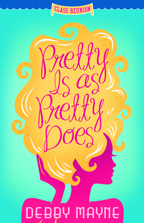
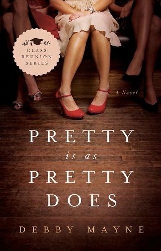
Pretty is as Pretty Does by Debby Mayne
Priscilla Slater goes to her ten-year high school reunion with equal parts dread and eager anticipation. Even though she’s a successful owner of a chain of hair salons and no longer has the mousy brown hair, crooked teeth, and discount-store wardrobe, she still feels like the ugly duckling. But when she arrives at the reunion, Priscilla soon realizes that her old classmates aren’t exactly as she remembers them. With humor and a just a touch of sassiness, Priscilla finds herself facing her own truth—and she may be surprised at what she discovers.
BEFORE
AFTER
Secrets Over Sweet Tea by Denise Hildreth Jones
Secrets can be funny things. We think they keep us safe, but more often than not, they spill out when we least expect and make a mess out of everything. It’s a truth Scarlett Jo Newberry knows all too well—a truth Grace Shepherd and Zach Craig are about to learn the hard way. As the lives of this boisterous pastor’s wife, polished news anchor, and beleaguered divorce attorney intersect in the tree-lined streets of Franklin, Tennessee, scandal threatens to topple their carefully constructed worlds. Grasping at survival, they embark on a journey of friendship and courage, desperate to find a way back to laughter, love, and life.
BEFORE
AFTER
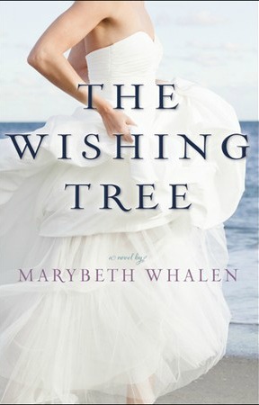
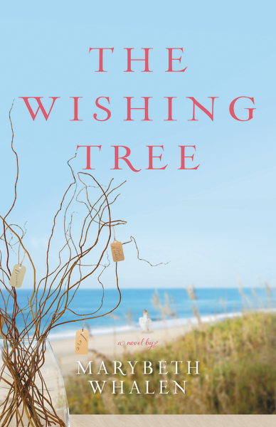
The Wishing Tree by Marybeth Whalen
In The Wishing Tree, Ivy Marshall, a savvy, determined woman, finds out her husband has cheated on her on the same day her sister’s perfect boyfriend proposes on national television. When Ivy’s mother asks her to return to her family’s beach home to plan her sister’s upcoming wedding, she decides to use the excuse to escape from the pain of her circumstances. When her return to Sunset Beach, North Carolina, brings her face to face with her former fiance, old feelings rise to the surface and she wonders if there is a future for them. However, her husband has started tweeting his apology to her and doesn’t want to give up on their marriage. As she helps prepare the wishing tree for her sister’s wedding, she must examine her own wishes for the future and decide what love should be.





December 11, 2012 at 8:19 am
Like Marybeth’s “before.” Prefer Denise’s “after” as well as the “after” of Pretty is as Pretty Does. I wish we’d be able to see more “before and after” covers like this – one knows that designers go through more than one concept and I like seeing that! It’s fun. 🙂
December 11, 2012 at 2:36 pm
Rissi » Love that you enjoyed this post, Rissi – it completely fascinates me 🙂 Glad I’m not alone!
December 11, 2012 at 8:45 am
I love Debby’s improved cover. Very chic and southern. Denise’s before was never one I was thrilled with, seemed kind of violent, I could you could say, and the after is a better fit both in color and for the title. I don’t like the possible after for Marybeth’s cover. I’m not really a scenic cover lover though, so I hope it’s just the bride that gets the final vote. 🙂
December 11, 2012 at 2:35 pm
Casey » That is so interesting, Casey – that you found the first cover of Denise’s to be violent. That didn’t cross my mind – I just imagined she dropped the tea cup accidentally – LOL! This is why covers fascinate me as different people see different things and feel different emotions when looking at the same thing. Like I said to Amber, did you notice the bride in the second Marybeth cover?
Appreciate you sharing 🙂
December 12, 2012 at 2:22 am
The shattered tea cup just played a different image for me, I guess. Didn’t seem to fit the title of the story, which is why I perceived it as “violent” I think. Yes, I did notice the bride on the beach…but she’s so very distant. I agree with you, covers are great conversation starters! 🙂
December 12, 2012 at 7:14 am
Casey » Your eyes are better than mine then 🙂 Loving this conversation – thanks for joining in again!
December 11, 2012 at 9:10 am
Wow! The “Pretty is as Pretty Does” covers are so different!! I personally like the second cover better, but it’s not super eye-catching… However, I think it has a better chance of catching its target audience with that second cover! 🙂
As for “Secrets Over Sweet Tea,” that second cover is lovely!! I love the covers and the tea spilling out! And did the designers read our comments here on your blog for the “Before” cover? ‘Cause I think someone mentioned that sweet tea brings to mind iced tea vs. hot tea, right? 🙂
And neither of the covers for “The Wishing Tree” really stand out much to me. :\ Kind of a bit plain… But the wedding dress is pretty. 🙂 Not sure how the title fits in with that “Before” cover, though!
Thanks for sharing this with us, Rel! Always fun! 🙂
~Amber
December 11, 2012 at 2:33 pm
Amber S. » Yes, you are right, Amber! My dear blogging friend Jenny talked about hot tea v. sweet tea in that post. Very interesting that they changed it. When I first saw the title, I immediately thought of sweet tea as I don’t think of Americans drinking a lot of tea (hot tea, that is). Here and in the UK, tea is hot tea and sweet tea is not really on the radar.
Did you see the bride is actually on the second cover? I only saw her after I’d looked at the cover numerous times – LOL! Anyone else pick her up? My struggle with the first cover is the non-existent connection of the bride to the title.
Have a great day, Amber xo
December 11, 2012 at 11:30 am
I agree Rel! The second covers are more eye-catching. I like your fascination with covers.
Keep up the good work here, sweet Rel! 🙂
December 11, 2012 at 2:29 pm
Ganise » Thanks Ganise 🙂 Glad you enjoyed seeing the comparisons!
December 11, 2012 at 12:32 pm
I LOVE Debby’s cover. LOVE that.
December 11, 2012 at 2:29 pm
Jenny B. Jones » And I LOVE that YOU visited 🙂 Thanks for sharing, Jen xo
December 11, 2012 at 2:57 pm
Your post made me think of the original cover for The Fiddler by Beverly Lewis, which I first saw on this blog. I loved it! I thought it was one her best covers, and one of the best covers in the Amish genre. I was so surprised when they changed it! The new cover was fine, but I thought the original was much more compelling. I totally agree that the new covers are almost always better, but that was an exception for me. I’ve wondered what made them change it.
December 12, 2012 at 7:08 am
Lisa E. » I remember that change, too, Lisa – thanks for sharing. It would be fascinating to know what makes publishers change their minds!
December 11, 2012 at 11:39 pm
Thanks Rel for this great post. I found the cover changes fascinating. I loved the afters for the first two and agree with one of the commenters that neither of Whalen’s covers grab me. I love covers and always wonder about the process. I spoke to an author about how much input she had in choosing the cover. It seems it depends on the publisher and the author. A favorite cover of this season’s offerings is Dorothy Love’s Every Perfect Gift. Love the cover, but think it had less to do with the story and more to do with when the book was to be released.
December 12, 2012 at 7:09 am
Beckie B. » Dorothy’s is particularly eye-catching, isn’t it? I’m glad you enjoyed the post – I’m loving everyone’s comments.
December 12, 2012 at 12:50 am
After reading the comments, I wanted to explain the change in the covers for Wishing Tree. The first one was the cover for a few months– and I LOVED it. Still do. However, the publisher feels that the cover is a bit misleading– that it makes a reader think that the book is about a bride… And while the book is about a woman helping with her sister’s wedding (so a bride is involved) it’s not solely about that. And in the original cover there’s not one hint of the wishing tree that the story revolves around. They really felt that a wishing tree should be more prevalent, hence the revised cover. I hope this clears it up a bit. I am sad that beautiful cover they originallly designed isn’t going to work out, but the new cover is growing on me. I hope that it’ll still inspire women to reach for the book, and that readers will be touched by this story about wishing and forgiving and learning what love really is.
December 12, 2012 at 7:13 am
Marybeth Whalen » Thanks so much for dropping by and sharing, Marybeth – appreciate you! I agree with your publisher on the first cover – it’s a little of a pet peeve for me when the cover art doesn’t match the title. Doesn’t mean I don’t like a cover but it bothers me. An example is Meg Moseley’s A Stillness of Chimes – I adore the berry stained hand on the cover but am confused as the title evokes bells not berries! I definitely prefer your second cover as the tree is there and the little notes add such mystery. I have no doubt readers will jump at the chance to read another Whalen story, Marybeth 🙂 xo
December 12, 2012 at 4:52 am
In every case, I liked the second cover better, Debby Mayne’s particularly. I’d pick that one up! The picture really illustrates the “Pretty is as pretty does” maxim, and hints at humor, also.
With Marybeth Whalen’s, the pose on the first cover kind of looks like the girl is pregnant. Maybe it’s just my take! But the second cover fits the title better, with little notes tied to a tree.
December 12, 2012 at 7:14 am
Ann Shorey » I’m with you, Ann – the publishers have improved each cover. Appreciate your thoughts, as always xo
December 12, 2012 at 5:20 am
Very interesting post, Rel. I am also fascinated when a cover goes through a change after being released, so to speak. Covers may change many times before this happens, but it is much rarer to see it at this stage. I agree that I usually like the change, but I have seen some when I did not. In the case of these three, I like all of the second covers better. Debby’s second cover is wonderful!. Again, I don’t mind cutting off heads when the eye is drawn elsewhere for a reason. The pigeon toes on the red shoes really sets a tone. The first cover was too chick-litty to me, which is not selling as a genre right now and probably one of the reasons for the change. I agree with Casey that Denise Jones’ first cover evoked a sense of violence. The second evokes “spilling” secrets over Southern iced tea, a better fit for her usual Southern fiction, even though she does deal with serious issues usually. I do not like the cut-off heads here. Having people usually lends needed warmth to a cover, but these do not. They just look weird to me. They remind me of the silhouettes on the old kid’s show “The Electric Company.” “Sw…” “eet.” “Sweet.” I enjoyed seeing what Marybeth Whalen said about the covers. I figured the change had to do with making it look more like a women’s fiction/literary type novel instead of a straight romance. One of the first rules of a cover is to have the book reveal its type and genre to the reader. You never want disappointed readers. That can be bad for future sales. Great post, Rel!
December 12, 2012 at 7:17 am
Aaron McCarver » Thanks for your insightful comments, as always, Aaron. The sweet tea cover conveys so much more than the first one, I agree. Especially all those Southern qualities! The pigeon toes are perfect, aren’t they? Again communicates so much yet so simply – love that!
Care to share how much input you have had with your covers, Aaron?
December 12, 2012 at 10:25 am
I feel I have been very fortunate with my covers. For my first series I wrote with Gilbert Morris for Bethany House, they allowed me a lot of input. They included a deer on the back of the first book with a white circular design just as in the story. The only thing they said no to for that one was a coonskin cap on the hero, which many frontiersmen wore in 1700s America. They thought it would make him less attractive. When I began writing Heartsong historicals for Barbour, they also gave Diane and I a lot of input. They included a mockingbird in a cage and a Christmas scene on “The Mockingbird’s Call” (even though the book released in February) but left the glasses off the hero. They made changes we requested to each of our three Heartsongs set in Mississippi from the originals. On “Across the Cotton Fields” they changed the heroine’s hair from red to dark as was needed. On “Among the Magnolias” they changed the color of the flowers. The type of magnolia used was pink. This is a problem for a Mississippian as the white magnolia is the state flower and the state tree. Many, many things in MS have white magnolias. They changed the flowers from pink to white, and we were very relieved. I might not should reveal this one, but on “As the River Drifts Away” they changed the riverboat in the background. We recognized the original as being a stock photo of a riverboat casino in Vicksburg. They were unaware of this and altered it for us. For our current series, they have given us even more input. For “Lily” they sent us three dresses they had selected from a costume shop and let us chose the one we thought our heroine would be more apt to wear. They used that one. They even sent us a picture of the model they wanted to use for Lily to see if we approved, which we wholeheartedly did. They used our suggested color scheme for “Camellia” with the oranges and reds, and they used my idea for the dark backdrop, including the fireworks, on our July 2013 release, “Jasmine.” It should be showing up online pretty soon. We hope you like it. I have heard that some publishers allow little to no input from the authors, but I have always had publishers and editors who ask for a lot of input.
December 16, 2012 at 3:07 pm
Fascinating, Aaron – so appreciate you taking the time to share in detail about your own experiences. Looking forward to seeing Jasmine, now even more so 🙂
December 12, 2012 at 10:31 am
On a similar tangent, you might want to ask some authors about any title changes that have happened. I know my first book with Gilbert started out from us as “Hawk,” went to “As the Deer” by one editor, and ended up as “Over the Misty Mountains” by the editorial board. Most books go through many, many title suggestions before being revealed.
December 16, 2012 at 3:05 pm
Aaron McCarver » Well, Aaron – here I thought I hadn’t read any of your books but I have! Over the Misty Mountains is on my bookshelves and I read it a very long time ago – LOL!
December 12, 2012 at 5:23 am
Oh, and one more thing about Denise’s cover. Drinking sweet tea out of a Mason jar is also verrry Southern!
December 12, 2012 at 7:07 am
Aaron McCarver » So I understand 🙂 We use Vegemite jars!! Well, not for sweet tea but for any other drink 😉
December 12, 2012 at 7:15 am
On Debbie Mayne’s, I really like the before better. The after is just too similar to other covers. But the other two, I like the after pictures better. Especially Mary Beth Whalen’s. The before seems too generic perhaps? I’m not sure, but I do know that I’d more willingly pick up the second cover than I would the first one. I can only imagine how difficult it is to pick out a cover for a book though.
December 12, 2012 at 12:18 pm
I like the second cover of all the books. As for my book Pretty Is as Pretty Does, the first cover is eye-catching, but it doesn’t capture the essence of the story. The second cover is spot on and even better than what I had in mind.
December 16, 2012 at 3:04 pm
Debby Mayne » Lovely to hear that, Debby – it must be an anxious wait to see if your covers match the story you have painstakingly written.
December 14, 2012 at 2:38 am
First, I want to thank Rel for writing this piece. And I like Marybeth wanted to explain a little about the covers. My publisher has always been gracious to try to give me covers that I love. And I have never liked people’s faces on my covers. I know…crazy. But just me. And the original “Sweet Tea” cover reveals a pivotal scene in the book. So I loved it – plus it is very congruent with the styling of my other covers.
But we got feedback about the very things y’all have discussed here that it is not the initial image that pops in your head when you think of sweet tea and us crazy southerners. So, it was changed. But it is wonderful to hear that you like it!
Best,
Denise
December 16, 2012 at 3:03 pm
Denise Hildreth Jones » Thanks for dropping by, Denise – appreciate you! Loved that you shared about your covers – the process is fascinating and I’m thrilled you have had input into your covers. Makes sense to me that you wouldn’t go for faces – I’m sure you have your characters in your mind and no doubt it’s hard for a publisher to “copy” that person to the cover!As an Australian, hot tea in a teacup is perfectly normal!!!!
December 14, 2012 at 2:50 am
I really like the first cover of Denise’s book better than the second. The first cover seems more exciting to me, like she dropped her teacup during a “GASP!” moment. The second cover is pretty, but very sweet, and reminds me of two pretty girls gossiping. Plus, I don’t really get the splashing thing with a still glass. Pretty and sweet but not very exciting. Regardless of the cover, I’ll read Denise’s book just because she is one of my fav authors. I like both of MaryBeth’s cover although the wedding dress cover gives the reader a huge clue there’s a wedding involved. I like Debby’s second cover the best. The first cover looks like so many covers out there already, so the second cover stands out more for me, and invites me to look at it.
December 16, 2012 at 3:00 pm
Rebecca » Loved your thoughts, Rebecca – thanks for sharing. Denise always writes well, doesn’t she? Loved her Savannah books!