During my time in the US, I got to connect with many amazing authors but I also had the opportunity to meet up with many of the dedicated professionals within the Christian publishing industry who work behind the scenes, so to speak ~ publishers, publicists, designers, marketers, editors, agents, and the like. I thought that you, my dear readers, may find the things they do fascinating so I’m beginning a new series of interviews, highlighting some of these brilliant people who are so very passionate about all things books!
Meet HarperCollins Christian Publishing’s
Art Director
Kristen Vasgaard
~~~~~~~
If you have been hanging around my blog for any length of time, you will know that highlighting and discussing cover art is a passion of mine, and every time a new batch of covers release, we have a grand old chat about what we love and sometimes what we don’t. In light of these discussions, I thought it would be great to seek some input from someone who really knows what they are talking about within the industry when it comes to cover design.
I had the pleasure of meeting Kristen while I was in the US in September and she is one delightful and talented woman.
Please enjoy the first of our two part exclusive interview. It would be lovely if you could show your appreciation to Kristen by commenting or asking a question below.
~~~~~~~~
Rel: Welcome, Kristen! Please share a little about yourself
Kristen: Hi! I’m so honoured to be interviewed for this blog! I’m the art director for fiction at HarperCollins Christian Publishing, so I work on covers for both Thomas Nelson and Zondervan fiction. I have worked in publishing for nearly 8 years, and have loved it because I have always been an avid reader and collector of books. When I’m not happily working I love to travel, find new restaurants, paint, and run a little etsy shop with handlettered prints.
Have you always worked in publishing?
I started my design career at an advertising agency in Knoxville, TN, where I worked on designing ice cream packaging and advertising. The best part about the job was endless supplies of ice cream! But I have always had a love of reading and books, so I started looking for jobs at publishing companies, and was fortunate to get the position at Thomas Nelson.
What studies/training did you do for this role?
I attended a small liberal arts college in Tennessee where I majored in fine arts with an emphasis in graphic design. I also took a lot of photography and painting courses, which have definitely helped my understanding and evaluation of mediums other than design created by computer. And, of course, practical experience in design firms was invaluable. I learned how to manage schedules and multiple projects, work with clients, prep files for print, and approach design from a consumer’s point of view, not just an artistic one.
What do you enjoy most about designing cover art?
I love the wide variety of projects and content that I work with. It keeps me on my toes creatively as I am always looking for fresh, creative solutions. The job never gets boring!
What frustrates you most?
There are times when I get really excited about a particular design or idea and no one else gets on board with the idea. It’s frustrating to let those covers go when I feel like they are the best solution, but in the end we may have to use something with a broader appeal.
What elements of the design process do you do personally?
In my role as art director, I’m very involved with the conceptual ideas for the cover, which includes reading manuscripts, having meetings with the editors and publisher to get specific input, sometimes talking to the author about their ideas, researching covers and artists, and conveying all this to a designer. I also do a lot of tweaking to the comps I get (comps are design ideas…it’s slang for compositions, an out-of-date word for proposed designs), which I do myself or direct the designer on. If a photo shoot is involved I direct what poses and shots I want and select costuming and hairstyles.
I also will design some covers myself, especially if I have a really strong idea, or if I need to start from scratch under a tight deadline. I can’t do this on all of the covers because the number I work on is too great and I need a variety of design styles so all the covers don’t look too similar.
What parts of the design process do others do?
The designers I hire will take my direction and create the cover comps. Sometimes they do exactly what I ask for and often they design their own ideas based on their interpretation of the material. Those comps are usually fun because I work with some very talented designers and I love seeing their unique creative solutions. The designers will also design the spines and back covers.
Please share a cover you have designed you are especially proud of, and why?
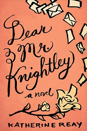
I am really excited about the cover for Katherine Reay’s debut novel Dear Mr. Knightley, which the very talented Lynn Buckley worked on with me. It is a fantastic book that deserved a special design, and the result is a fun cover that’s different from most of our covers, and the final printed version is even better than it looks on screen.
I also really love the design on Stones for Bread. It’s simple and elegant but really conveys the tenderness of the story.
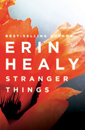
One of my favourite writers is Erin Healy, so I always have fun with her covers. The Stranger Things cover is really different for Erin, but the bold colors and “hidden” image of the woman make it really intriguing.
As you know, we have great discussions on my blog about covers with “decapitated heads”! Can you explain why this has become such a popular method?
Ha! It certainly is a trend these days, as is showing women’s backs. I’ve seen these two trends emerge as a departure from the trend of showing close up shots of women’s faces in the foreground, which is another popular design style in Christian fiction especially. We’ve heard comments from some readers that they want to visualize the hero or heroine on their own, so that is another theory behind the decapitated heads. And from a practical perspective, it’s much easier to find stock photos to use when you don’t have to worry about matching a specific hair or eye color!
As a designer, what catches your eye the most when you are in a bookstore?
In the fiction sections bright colors usually catch my eye. In a category dominated by photographs and people, any kind of bold, bright design really stands out. I also am always looking for inventive and elegant new ways to feature a woman on a cover or convey the historical time period of a book.
Please share a favourite book cover that you wish you had designed?
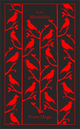
(Rel: Kristen ~ I actually bought this gorgeous copy of Les Mis, designed by Coralie for my 15 year old who wanted to tackle this classic after seeing the movie. It really is a beautiful book and I’m proud to say she is a third of the way through and loving it!)
It’s so hard to pick just one! I am jealous of the amazing talent of Coralie Bickford-Smith, the genius behind the cloth bound classics for Penguin http://cb-smith.com/#/cloth-
Also, I love the ingenuity behind the Penguin Threads classics that Jillian Tamaki embroidered and Paul Buckley commissioned. http://blog.jilliantamaki.com/
Love those unique covers, Kristen ~ thanks so much for sharing with my readers today.
Stay tuned for Part 2 of my interview when Kristen talks current cover art trends, and walks us step by step through a cover design process, complete with pictures!
Relz Reviewz Extras
Visit Pen, Meet Paper ~ Kristen’s Etsy Store








November 9, 2013 at 1:31 am
I enjoyed reading this interview! It’s great to hear from an art director. And I just love the cover for DMK! It’s such a gorgeous cover and fits the story well. 🙂
November 9, 2013 at 8:46 am
Jillian » So glad you enjoyed it, Jillian – you will love Part 2!
November 9, 2013 at 1:56 am
Rel, Thanks for introducing us to the very talented lady. I’ve had the pleasure of meeting Kristen and working with her on designs for three covers of novels published (or scheduled to be published) by Thomas Nelson. Bless her heart, she’s patience personified when we ask her to tweak covers, but always gets them right.
November 9, 2013 at 7:22 am
Thanks for the kind words, Dr. Mabry!
November 9, 2013 at 8:46 am
Richard Mabry » She is a lovely person, isn’t she, Richard? Appreciate you sharing your thoughts.
November 9, 2013 at 2:20 am
Kristen, thanks for doing the interview.
One thing I’m sure art directors and authors both dislike is to run across a cover very similar to one you’ve already created. We’ve all seen a stock photo that seems to get overused for covers. Are stock photos still used quite a bit? Or is it more common now to really tweak photos and mix them with others so they have their own unique look?
November 9, 2013 at 7:22 am
Sally, that is definitely one of my biggest frustrations I forgot to mention….when I find the “perfect” stock photo only to discover it is already used on another cover! Yes stock photos are still used a lot because they are more economical, take less time to set up than a photo shoot, and are a better variety of locations and styles. When possible we take parts of stock photos and blend them together for a more unique image, but sometimes the photo just works without changes.
November 9, 2013 at 8:45 am
Sally Bradley » Great question, Sally 🙂
November 9, 2013 at 3:22 am
What a fun and interesting interview!! Books covers are always a hot topic for me (mainly because I’m a cover snob :), so it’s wonderful to have an insider’s thoughts. I love love love the DMK cover – it fits the story perfectly! Excited to hear more about the trends of Christian fiction design – as it plays such an important role!
November 9, 2013 at 8:45 am
Jamie Lapeyrolerie » There’s nothing wrong with being a cover snob, my friend, you just have very fine taste, right?!
November 9, 2013 at 9:25 am
Yes, that’s what it is 🙂 🙂
November 9, 2013 at 3:25 am
P.S. Kristen – your etsy shop is fantastic! Whenever a Cali print comes out – I’m all over 🙂
November 9, 2013 at 7:19 am
Thanks Jamie! I do have a Cali print in the works so stay tuned!
November 9, 2013 at 5:12 am
Eep!! Kristen!!!! Thanks for the cool interview, Rel! I, too, am a rabid fan of Kristen’s beautiful work, and it’s a pleasure to get a sneak peek inside her world. One of the things I admire most is how unique each of her designs look and the detailed attention she gives. And that Stones for Bread cover? Oh man. Makes me swoon EVERY TIME.
On a personal note, I was recently spoiled to have Kristen design my book cover, and I don’t think she knows this, but I fully squealed when TN released the image. My reply email was pretty much a bunch of hyperactive exclamation points. Ahem. ;0)
We love you, Kristen!!!!
November 9, 2013 at 7:19 am
Mary you are too kind! Come visit Nashville soon!
November 10, 2013 at 5:01 am
Kristen, yes on the Nashville thing! Cannot WAIT to visit. :0) (And in the meantime, I’m reading/geeking out over Katherine’s Mr. Knightley. ABSOLUTELY BRILLIANT. Perfect writing, perfect cover.)
November 9, 2013 at 8:43 am
Mary Weber » Hey Mary – lovely to have you visit. I’m with you the Stones for Bread cover is beautiful in it’s simplicity – that appeals to me greatly.
And so others can know what made you squeal, Mary, I’m linking your cover blog post for Storm Siren here for people to check out! I agree it is visually stunning 🙂
November 10, 2013 at 4:50 am
Oh gosh – that’s very sweet of you, Rel. Thanks! I hope you have a fabulous weekend!!!
November 16, 2013 at 12:47 am
Mary Weber » My pleasure…late as this response is 😉
November 9, 2013 at 5:45 am
Wow! This was fab fun, Ladies! I’ve always been interested in the design aspects so reading what goes into it is wonderful – thank you for all this hard work, Kristen. 🙂
DMK is a gorgeous cover art – it’s simple, yet full of whimsy and beautifully “captures” the essence of Katherine’s novel. Well done!
November 9, 2013 at 8:37 am
Rissi » Looks like Dear Mr Knightley’s cover is a big hit for most of us! Love that 🙂
November 9, 2013 at 6:01 am
What a fun and informative post! Great questions Rel. It is so intriguing to see how the development of those much talked about covers comes about. I have quite a few of Coralie Bickford-Smith clothbound series and just bought the Great Gatsby with her new cover. I am quite the classic book hoarder especially when there are interesting covers that I use for display. Looking forward to more behind-the-scenes interviews.
November 9, 2013 at 8:36 am
Lydia » Coralie’s designs are beautiful, aren’t they? And there is just something extra special about a clothbound book. Do you have favourite classic book cover, Lydia?
November 9, 2013 at 6:55 am
Fantastic interview! I haven’t thought much about cover designs, only that they can be beautiful and unique and fit perfectly with the story. Thank you for sharing some more info to what you do! I love the Dear Mr. Knightley cover. It was a perfect fit!
November 9, 2013 at 8:35 am
Kate » I have a friend who honestly does not give the cover any consideration whatsoever when selecting a book. It’s just not on her radar – I think she may be fairly unique in that regard! Thanks for sharing, Kate
November 9, 2013 at 7:51 am
This interview was wonderful. Loved learning more about you, Kristen. And as for my opinion on the DMK cover, it is beyond anything I imagined and just looking at it still brings a goofy grin to my face. It represents all the hope, whimsy and love Sam didn’t know she needed. Thank you, Kristen! … Now I must run… Literally 🙂
November 9, 2013 at 8:33 am
Katherine Reay » Thanks for dropping by, Katherine, and all the best with our run today! There’s is certainly lots of love towards your cover and I know there will be for what’s inside the cover 🙂
November 9, 2013 at 9:42 am
Very fun to see 🙂 I happen to really like the cover for Stone for Bread as well. In my eyes, it beautifully conveys both simplicity , vulnerability and tenderness. Gorgeous.
November 16, 2013 at 12:49 am
Ganise » Well said!
November 9, 2013 at 10:18 am
Hi Kristen! I think you guys do an awesome job with covers, there aren’t too many that I hate LOL! I think I’d love to be a part of the costume and wardrobe selection — that has to be sooo fun! I love the covers that you selected as faves, including the classic novels. Have you all seen the covers for Barnes and Noble’s leatherbound classics? They are some of my all-time favorite covers. http://www.barnesandnoble.com/s/leatherbound-classics?store=allproducts&keyword=leatherbound+classics Thanks for sharing this fun interview, Rel. I love going behind the scenes. 🙂
November 10, 2013 at 1:57 am
Oooh those are beautiful! I’ve seen some of those leather-bound classics but not all of them. Might have to add a few to my collection!
November 9, 2013 at 10:44 am
Lovely to meet Kristen. Thanks Rel for sharing Kristen with us. I’m looking forward to part 2.
November 9, 2013 at 10:57 am
I loved this! It’s so fun to get a behind the scenes look at cover designs. I especially liked hearing about the decapitated head trend. That makes a lot of sense actually. Even if they do kind of bug me sometimes! 😉 Fabulous interview, Rel. Now I’ll probably notice covers even more! And I’m now getting ready to read DMK. I’d forgotten it was out already. And I love the cover for it, Kristen! Great job.
Can’t wait for part two. 🙂
November 10, 2013 at 1:58 am
Thanks so much, Kara!!
November 16, 2013 at 12:48 am
Kara » Thanks, dear Kara – Kristen did an amazing job, didn’t she? Hope you enjoy DMK – I’m sure you will!