Back with Part 2 of my exclusive interview with the fabulously talented, Kristen Vasgaard, who the Art Director for HarperCollins Christian Publishing. Before you dive in here, make sure you have read Part 1 of our interview where Kristen shares about who she is, what she does, some book covers she adores, and a lot more interesting stuff!
Today, Kristen responds to more detailed questions and takes us through the cover design process, step by step. We hope you enjoy!
Learn more about the cover design process with
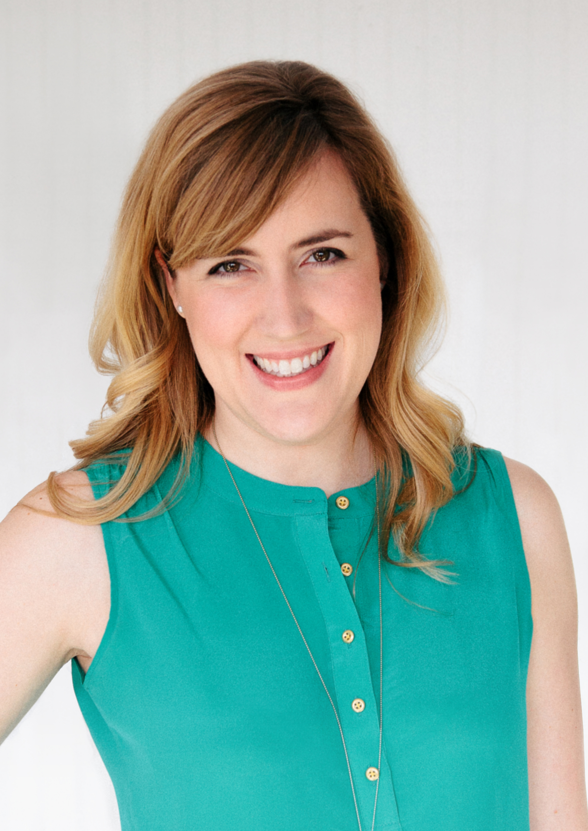
Kristen Vasgaard
Art Director, HarperCollins
~~~~~~~~
Rel:~ Can you describe the design process from the first ideas to completion?
Kristen:~ I have a monthly meeting with the editors and publisher to discuss upcoming books about 9-12 months before they appear in stores. The editors provide a summary sheet with helpful information and a manuscript, and we spend some time talking about target markets, comparable covers, the tone and style of the story, and important details. From there I do further research, sketch out some ideas, and contact the designer I feel is most appropriate to design the cover. I give as much information as I can to the designer and they have 2-3 weeks to return 3-5 comps to me. If the comps are appropriate I will then show the publisher, and we’ll discuss the viability of the ideas with the editors, eventually pulling in the author for final approval. Usually in that process are several rounds of revisions to the cover to make sure it’s just right for the book…sometimes the changes are minor, like hair or eye color, and sometimes they require throwing all the ideas out and starting over. Also, if a photo shoot is required, I will contact a photographer and get model, clothing, and hairstyle options approved.
The final step for our front covers is a sales conference, which is held 3 times a year, and gives the sales team an opportunity to see all the covers and offer any pertinent feedback. After that, the covers are included in our catalog and sent to bookstore buyers and online retailers.
Do your ideas for a cover stem from the title or story first?
Even though the title is final before I begin design, most of the time I pull the cover idea from a scene or theme of the story, not the title. However, I’m always keeping the title in mind to make sure there isn’t a disconnect between the title and image, and that the visual reinforces the title to create the most impactful and appropriate cover we can.
What input do your authors have with regard to their cover design?
Our authors have the opportunity to approve their covers, so the editor solicits their input at the beginning of the cover process, and then they see a cover design (sometimes more than one) that we feel is the strongest solution, and we make any final revisions or tweaks from there. I try to cultivate strong relationships with my authors so we can have open dialogue about the covers and what’s working or not working. When there’s mutual trust in the process it’s a lot easier to get to a great design.
What is the best feedback you have received from an author when you have shown them their cover?
Oh this is a hard one! I’ve had screams, happy tears, really encouraging and thankful emails, and even flowers delivered! It’s really satisfying to have a happy author because I know the book is like their baby and I want to make sure I make it look better than even they imagined it would.
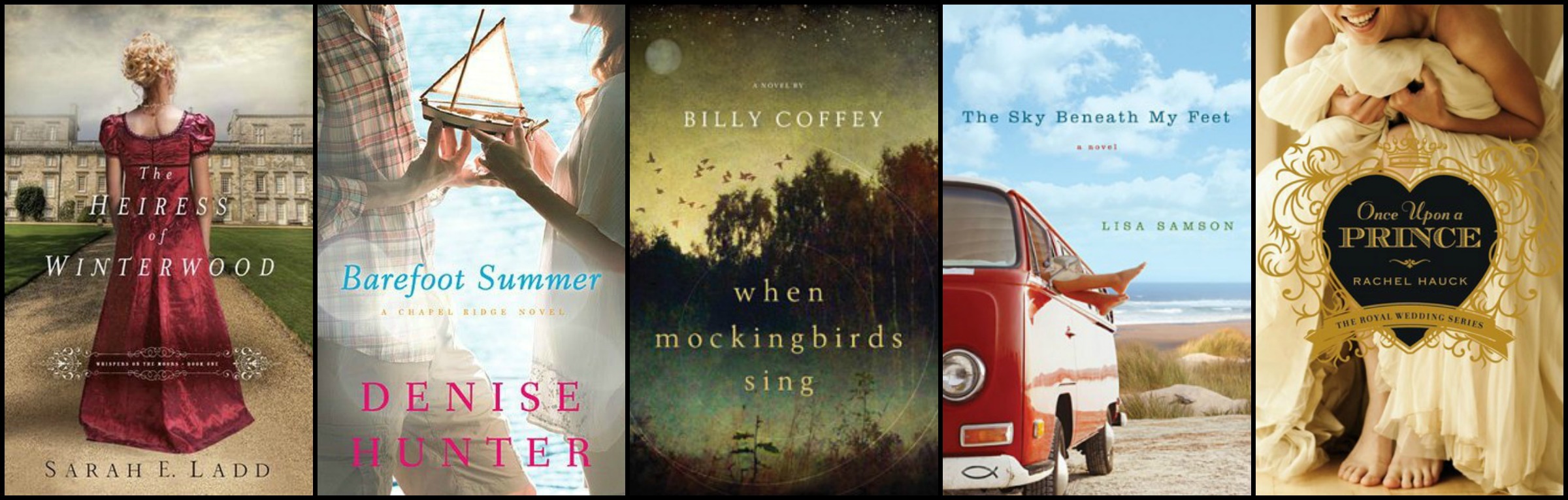
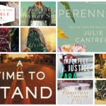
Here’s a handful of Thomas Nelson covers I love ~ Rel
Do you approach a contemporary cover in the same way as an historical cover?
On all the covers I am striving to create intrigue and appeal to the right audience, but on historical covers I definitely have to pay attention to establishing the right time period and getting the details and images historically accurate, while a contemporary cover doesn’t have those same challenges.
What popular trends do you see in cover art today?
Aside from the very popular decapitated bodies, I’m noticing more artistic poses of people in general…maybe a photo that focuses on the bodice of a dress or the heroine’s hands…there’s a trend toward details rather than big picture. Also, handwritten type and illustrations are very prominent right now as designers are leaning away from solely using the computer and incorporating the craft of design and art.
What differences (if any) do you see between general market fiction covers and many Christian fiction covers (aside from the obvious of certain ABA covers having more “skin in the game”)?!
I’ve always found ABA covers to rely on depictions of people a lot less than Christian fiction covers. ABA covers more readily use place, objects, and/or type to set the mood, while covers for the Christian market have more frequently used people and been a bit more direct in showing the characters and settings of the book. There has historically been more room for creative solutions in ABA than in the Christian markets, but I’m starting to see that shift as Christian covers become more diverse.
Can you share a cover journey in pictures? From first ideas to final cover?
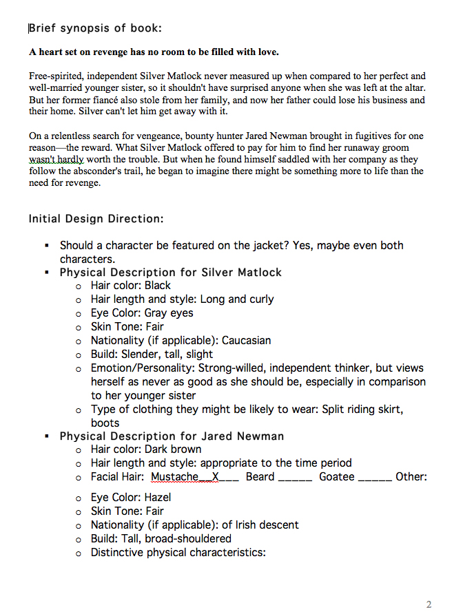
I always start with a document from the editor with information about the target market, story, key themes, and style of the book. It will also contain a story synopsis and character descriptions. I will review this document with the editor and then start brainstorming ideas for the cover, doing my own research.
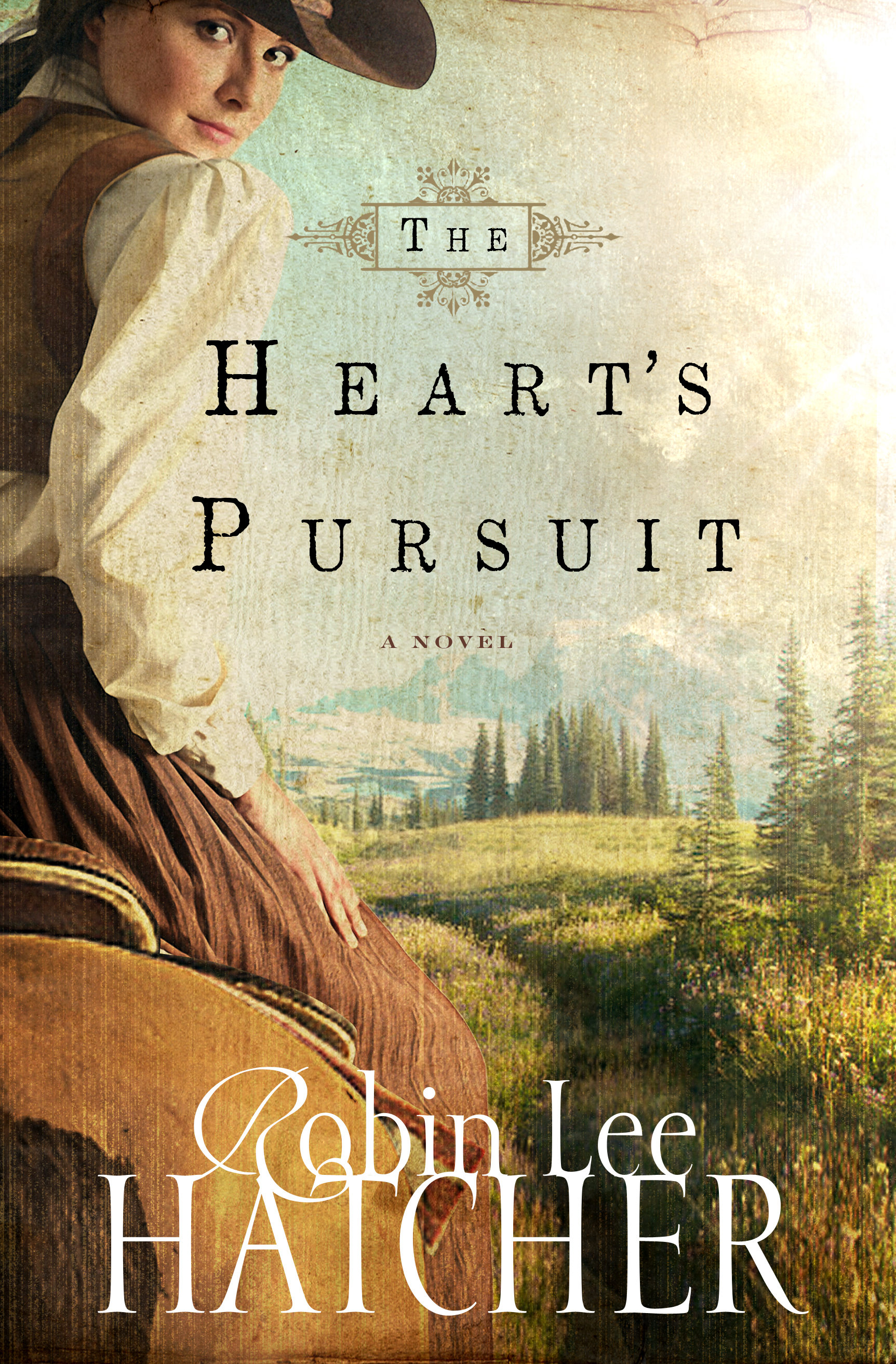
Here is a look at the design journey of Robin Lee Hatcher’s The Heart’s Pursuit, set to release in April, 2014 ~ hope you love the sneak peek!
The next step is to get ideas from a designer (or design comps myself) and I will discuss with the publisher, editor, and author and we will agree on a cover direction. If the cover requires a photo shoot we select a model and costume, then I direct the shoot and select the most appropriate shot from all the options.
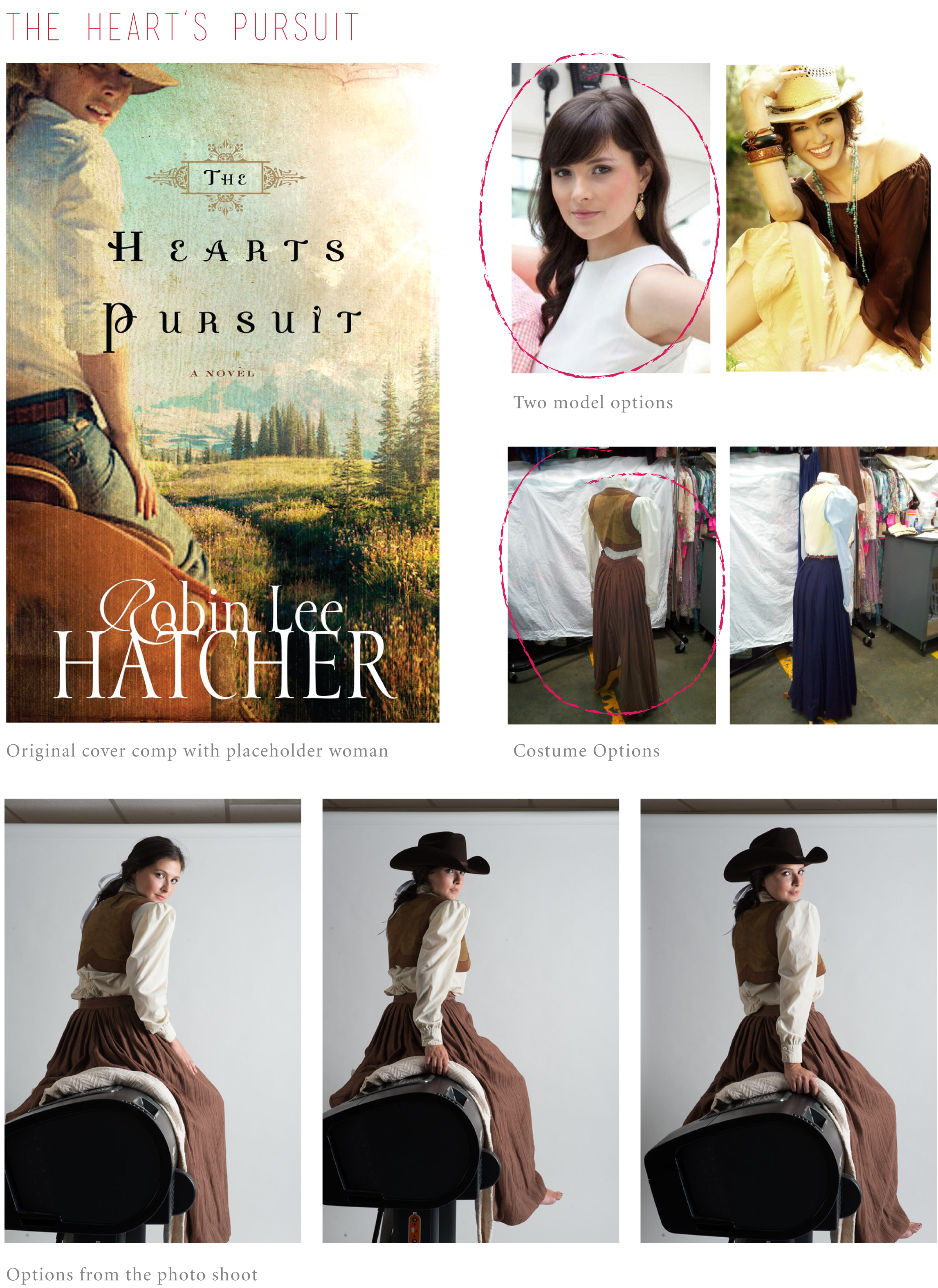
After the image is selected we place it on the cover and then continue to refine the image and design until we get a final cover!
What feedback from readers is most helpful to you?
It’s impossible to design a cover that will be universally appealing to all people, so comments about details like the color of a dress or typography usually aren’t as helpful as feedback about the overall feeling of the cover. It helps me most to know if a cover makes you bored or makes you want to pick it up immediately and other broad statements like that. And of course, feedback about how much someone loves a cover is always welcome! 😉
I can’t thank you enough, Kristen, for the time and effort you have put into providing us with real insight into your job and the cover design process. Appreciate you!
My dear readers, please add your comments and questions below to thank Kristen, and feel free to pick her brain a little with any questions you might have 😉
Relz Reviewz Extras
Behind the Scenes with Kristen Vasgaard ~ Part 1
Visit Pen, Meet Paper ~ Kristen’s Etsy Store


November 11, 2013 at 1:54 pm
Hello,
What a great interview! As a lover of covers, I found this fascinating. Thanks for the insider peek. And, Rel, thanks for the question about decapitations in Part I. Kristen, that is one of my pet peeves about so many knew covers these days, as Rel knows from my comments on her blog. 🙂 I found your comments about that very interesting. I like the covers that focus on something, as you mentioned, even if the person is decapitated. A couple of my favorite examples of this are “A Bride Most Begrudging” by Deeanne Gist and “Once Upon a Prince” by Rachel Hauck. I love the focus on the heroine’s crossed fingers on “Bride” and the focus of the whimsy on “Once” through the bare feet and the smile on her face. But some decapitations just cut off part of the head with no focus on anything else. These always seem a little odd to me. I really love this cover of Robin Lee Hatcher’s. The position of the protagonist draws the reader into the story as if following her on horseback. And the look on her face aides this feeling as well. I think it works better than if just her back were shown. And the added touch of the “antique” tone over the picture is outstanding to me! It makes me feel as if I am looking into a scene from the distant past, which is great for a lover of historical fiction like I am. As for a question, Kristen, what upcoming covers that have yet to be revealed are you really excited about? I know you can’t reveal details, but maybe just titles with great covers to look for in the coming months? Thanks again, Kristen and Rel.
November 12, 2013 at 8:46 am
Aaron, thanks for the thoughtful and kind comments!! It keeps me on my toes to know there are readers like you who are really evaluating the covers and how well they represent the book.
I just finished our catalog for summer books, and an’t give you too many details but I’m excited about Liz Tolsma’s next book, Daisies Are Forever; A Deadly Business by Lis Wiehl; The Secrets of Sloan House by Shelley Shepard Gray; and All’s Fair in Love and Cupcakes by Betsy St. Amant. I had a wide variety of genres this time and I think you’ll see how fun it was to design for such diverse books!
November 15, 2013 at 4:26 am
I just saw the cover for “Daisies Are Forever” on Amazon.com. Wow! It is truly awesome. Great job on that one! I also really like “The Butterfly and the Violin” cover. Thanks again for sharing about covers.
November 16, 2013 at 12:32 am
Kristen Vasgaard » Sooo excited that Shelley is writing for you, Kristen. While I’m not an Amish fan, I’ve loved her historical novels.
November 11, 2013 at 5:45 pm
Fabulous Rel & Kristen. Thank for the level of detail especially the example of the design journey.
Wonderful posts. Thank you to both of you.
November 16, 2013 at 12:36 am
Ian » Appreciate your kind words, Ian, as always
November 11, 2013 at 9:11 pm
Thanks Kristen and Rel. What a fascinating insight into how a cover comes about. Thank you both for your time put into sharing that journey with us.
November 16, 2013 at 12:34 am
Jen » Appreciate that, Sis xo
November 12, 2013 at 3:48 am
Enjoyed learning more about the art of creating covers.
November 12, 2013 at 4:38 am
First – Thank you so much for this two part series! Great to be able to have an open dialogue about something so important in the industry!
Second – the When Mockingbirds Sing cover is beautiful! I’d read it based off the cover alone.
Thanks so much again for the insight, it’s great to see all the thought going into it and the direction of the industry. It makes me sad that some people won’t read books based on the covers, even when I promise them they are fabulous. Excited for what the future holds!
November 12, 2013 at 8:47 am
Thanks so much, Jamie!
November 12, 2013 at 6:00 am
Again, this is fabulous! Loved reading through this, ladies!
In regards to the “headless” design that Kristen mentioned in both part 1 and 2, I like it generally although sometimes the “crop” or angle is “off.” Otherwise, I think – if done well, it adds a sense of mystery and is fantastically “classy.”
Very unique perspective – and I loved the behind-the-scenes look. 🙂
November 12, 2013 at 8:47 am
Very true, Rissi…headless designs can easily look really bad! Glad you enjoyed the post!
November 16, 2013 at 12:33 am
Rissi » So glad you enjoyed this, Rissi – Kristen is fabulous.