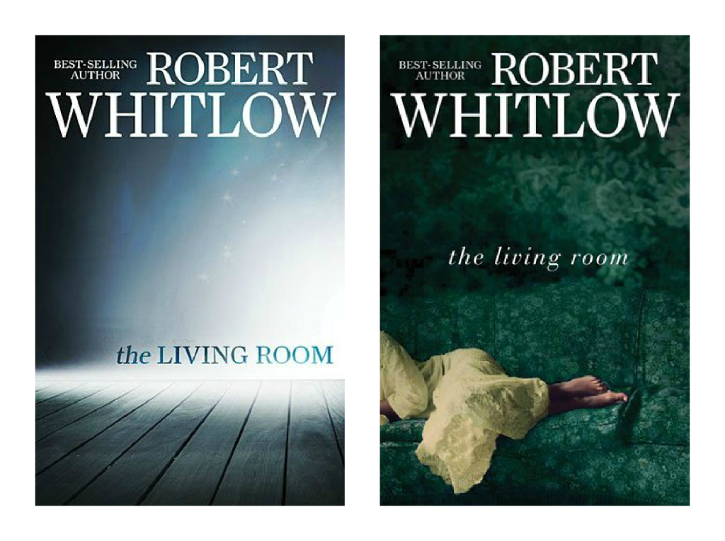
 Thomas Nelson has again revamped cover art for two of their upcoming 2013 releases – one for debut novelist Liz Tolsma and another for the multi-published Robert Whitlow. The covers on the left are the original cover and the ones on the right are the final covers.
I love that publishers are willing to review their initial choices on cover art and do a second take, no doubt from feedback received – that takes courage, cash, and commitment to their authors and readers. As I’ve said before the revamped cover is most often a vast improvement on the first attempt and that is certainly true of Robert’s covers. I was dumbfounded when I first saw the original cover of The Living Room – I felt it was dull and uninspired and didn’t reflect a living room at all. The second cover is much improved and communicates much more warmth and interest and reflect that a woman is at the heart of the story.
I have to say though, that I prefer the original cover for Liz’s book. Not that I think the final cover is terrible – far from it. If it had been the original I imagine I would have been positive about it – the gray tones give it the solemnity it needs as a World War II tale but I love the splash of red and hope that those tulips bring to the original cover.
So those are my thoughts ~ I can’t wait to hear yours!
Which cover do you favour? Which one best reflects the story to you?
Snow on the Tulips by Liz Tolsma
In the twilight of the Nazi occupation of The Netherlands, the Germans have taken everything Cornelia had to give, even what was most precious to her. Now Gerrit Laninga-a man who puts God and country above all else-arrives at her house, needing help. She is terrified for herself and terrified for her family, but most of all, terrified of the pain she might feel again if she allows herself to love Gerrit. Her hope is to be free from her paralyzing fear.
Gerrit is a known and hunted Dutch Resistance member. When he comes to Cornelia’s home for shelter, he’s drawn to her strength and kindness. When he asks her to contact the local Resistance on his behalf, she refuses. Gerrit is determined to find a way to continue his underground work without putting Cornelia or her family in harm’s way.
The Living Room by Robert Whitlow
What would you do if the dream you had last night came true today?
Legal secretary Amy Clarke is a budding romance novelist with an active imagination. However, unlike other writers, the inspiration for her books doesn’t come when she’s awake; it happens while she sleeps. Amy knows that the interpretation of dreams plays a significant role in the Bible. Could God be trying to tell her something?
Amy’s mother made her promise never to talk about her dreams back when she was a young girl. Now that she’s a wife and mother of two teens, the images are more disturbing. And instead of receiving them in dreams, the visions come when she’s wide awake. Staying quiet is no longer an option.
As her involvement in a high-stakes case at work exposes Amy to threats from unexpected places, her fourteen-year-old daughter, Megan, gets tangled up in rumors. Then Megan seeks solace in what only seems like a safe place.
Dreams, writing, and visions converge in unfolding events that threaten her career, but more importantly, the safety of her family. Faith and courage are the tools Amy must use to triumph in the end.


February 1, 2013 at 12:39 am
I’m really kinda bummed that Snow on the Tulips was revamped…I LOVED the original cover. The second one is nice, but I miss that little pop of red color.
February 1, 2013 at 11:19 am
You and me both, Ruth!
February 1, 2013 at 4:03 am
Robert’s cover is a vast improvement in my opinion. It’s still not a favorite of mine, but it does convey more to the reader. As for Liz’s cover, I am disappointed in the change, also. Yes, I know. I am always the one saying not to cut off people’s heads, but the original cover was much more poignant to me. I like the design of the second; however, the way the woman is positioned with her hair and eyes not showing adds no warmth. This was done with the tulips in the original. In the new one, I honestly thought the woman was a male soldier in a helmet at first glance. I then realized it was a period hat, which I like that touch, but the overall effect does not quite work. I do like the plane and the windmill in the background, as they set the time and place well. I still plan to pick this one up as I love historicals and the story sounds captivating.
February 1, 2013 at 11:21 am
LOL! Love your thoughts, always, Aaron 🙂 I totally agree with you on the poignancy of the first of Liz’s covers. Regardless of the cover, I can’t wait to read the story. I have always been fascinated with WW2 history (all history, really!) so I’m hoping the story is fabulous, too.
February 1, 2013 at 7:12 am
I’ll probably be a minority voice, but I like the new cover for both books.
February 1, 2013 at 11:21 am
And I’m glad you do, Richard 🙂 Good on you!
February 1, 2013 at 7:54 am
Agree. Liz’s first cover was way better. Loved that “pop” of red. Plus seeing the tulips brought the story together.
On the other hand, Robert’s is much improved.
Thanks, Rel!
February 1, 2013 at 11:22 am
Thanks for sharing, Rissi – always love hearing your thoughts.
February 1, 2013 at 12:04 pm
Seeing the unanimity (my own opinion excepted) of the responses, I wonder what Liz’s reaction to the revamp was. When Nelson changed my cover, I was pleased with the result. I’d be surprised if they didn’t have some dialogue with her about the change. Liz, are you listening? Just wondering.
February 1, 2013 at 1:20 pm
I agree with you on both counts. If I’d seen Liz’s new cover first I might have liked it, but now it just feels too grey and depressing, even though it is a WWII novel.
February 2, 2013 at 12:47 am
For SNOW ON HE TULIPS, I luv the new cover with the main character featured…beautiful! But I luv the color of the tulips and wish they could somehow incorporate them into the 2nd cover!…..but def prefer the 2nd cover over the 1st!
For THE LIVING ROOM, you are absolutely right….the 1st cover is like Huh?!? But I’m not sure the new one is any better (green on green) & really by the cover only I can’t tell if this is supposed to be scary or cozy?!?
February 2, 2013 at 12:51 am
But AFTER reading the synopsis for The Living Room, I like the 2nd cover better!!!
February 2, 2013 at 2:14 am
I think I prefer the older covers on both of those! For the first one, it’s close…I like them both. But the second? Definitely prefer the original cover.
February 2, 2013 at 6:01 am
I prefer the original cover for Tolsma’s book–those tulips lend a bit of hope to the dark tone (which I truly love), but I like Robert Whitlow’s new cover better. It grabbed me more than the dark/light and gives the cover distinction while staying within Whitlow’s other covers. IMNSHO. 😀
February 2, 2013 at 2:32 pm
I much prefer cover #1 for Snow on the Tulips…I think it fits the description of the book better. I also have to say that the cloche hat on cover #2 reminds me of Murray Pura’s Ashton Park.
Cover #2 is much better for The Living Room and while I think the darker green was a bit overdone, it does makes the woman on the couch seem a bit more prominent.
Thanks for sharing, Rel. =)