Here are some covers that have recently caught my eye! I’ll be posting further details of these books as they become available but couldn’t wait to share these with you and hear your thoughts on them.
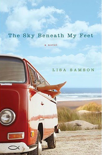
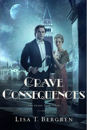
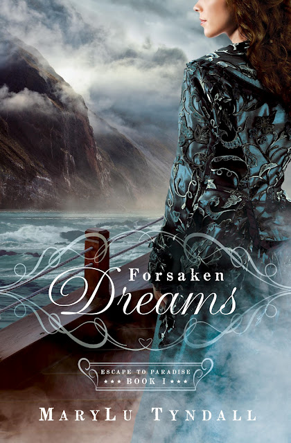
I ADORE Lisa Samson’s cover ~ she always has fabulous covers and this one is no exception. MaryLu’s is stunning even though it is a familiar theme for an historical romance and the background to Lisa Bergren’s cover is terrific although the cover models’ facial expressions are a little bit daunting – LOL!
Which cover appeals to you the most?





July 25, 2012 at 1:34 pm
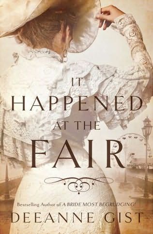
Hello?! Love these – particularly Bergren’s and Gist’s.
July 25, 2012 at 5:37 pm
Rissi » So what makes those two particularly appeal to you, Rissi? I love the sense of atmosphere created by both Lisa Bergren’s and MaryLu’s covers.
July 26, 2012 at 2:29 am
I think with Bregren’s it is the mystery that it captures. The setting at night and slightly aghast expressions on the character’s faces all pose suggestions that this will be mysterious. It seems to go well with the themes from book one also. Love it! Wonder if it is Will or Pierre!? ;-D
DeeAnne’s are ALWAYS a great deal of fun so I am looking forward to that plus the cover has such an old world feel that I just love! The design also lends mystery while telling that its era is a fascinating, elegant one. Great design! I still have to read her last book “Love on the Line” which sounds adorable. 🙂
July 26, 2012 at 5:55 pm
Rissi » Love those thoughts, Rissi 🙂
July 26, 2012 at 3:25 am
Yes, those two are AWESOME! And so are Sandra Byrd and MaryLu’s book covers. Breath-taking!!!! Can’t wait till these come out!!! 😀
July 26, 2012 at 3:33 am
MaryLu’s is also STUNNING, Katie. 🙂 Love it.
July 25, 2012 at 4:28 pm
Sure are some beauties there Rel.
I agree with you about Lisa Samson’s – could be the publicity shot for “Puberty Blues’ (Ha!). But I do like Tosca’s.
July 25, 2012 at 5:36 pm
Ian » I can’t wait to read Tosca’s regardless of what the cover looks like!! And yes, I agree on the Puberty Blues comment – LOL!
July 25, 2012 at 5:41 pm
I’ve never read any of Tosca’s standalone, only the 2 with Dekker. Another 2-3 on my reading pile. “Demon” is one I’ve always wanted to read.
July 25, 2012 at 10:50 pm
Ian » LOL! I haven’t read Demon but I loved her treatment of Adam and Eve in Havah – stunning interpretation.
July 25, 2012 at 7:06 pm
I’ve read the manuscript of Iscariot–it’s good!
I’m looking forward to reading MaryLu’s en Lisa’s. Love those covers best.
July 25, 2012 at 10:50 pm
Marian B » Hey Marion – great to hear about Iscariot though can’t say I’m surprised it’s good 😉 MaryLu’s and Lisa’s have a similar feel, don’t they? I’m assuming you mean Lisa Bergren’s as opposed to Lisa Samson’s, by the way.
July 25, 2012 at 11:53 pm
Yes, I meant Lisa Bergren’s. 🙂 Bergren’s and MaryLu’s covers look a bit mysterious, I think.
July 26, 2012 at 5:31 pm
Marian B » Totally agree on the mysterious atmosphere on both those covers – almost a little bit of a gothic feel!
July 25, 2012 at 8:07 pm
I like Deeanne Gist’s and Lisa Bergren’s. No surprise, but I would like MaryLu’s much better if the head was not cut off.
July 25, 2012 at 10:48 pm
Aaron McCarver » Love your consistency, Aaron! Thanks for sharing your thoughts 🙂
July 25, 2012 at 10:24 pm
My favorite of those is Deeanne’s. All lovely though!
July 25, 2012 at 10:48 pm
Lori Benton » Dee’s has a read olde world charm about it, doesn’t it?
July 25, 2012 at 11:11 pm
Woo-hooo look at those beauties! I’m so excited for Meg’s book, MaryLu’s is one of the best Barbour as done for her and DEEANNE’s, be still my heart. I can’t wait to find out what that one is about. Thank you, Rel!!
July 26, 2012 at 2:38 am
Casey, this is what Deeanne’s book is about according to the Simon and Schuster website.
A novel about a promising young inventor and the teacher who changes his life, set against the razzle-dazzle of the 1893 Chicago World’s Fair.
July 26, 2012 at 11:08 am
Oh my! Dee left Bethany House??? Is she is exclusively S&S now?
July 26, 2012 at 12:45 pm
I don’t know. She did say one time that she was going to try to write more than one book a year. I noticed that this book is only 288 pages; where her other books are 368 pages or so. I’m wondering if she’s cutting it shorter so she can write two books next year instead of just one. Maybe Bethany House didn’t want shorter books.
July 26, 2012 at 5:23 pm
Casey » Not sure about that, Casey, either.
July 26, 2012 at 5:27 pm
Casey » I so agree with you on MaryLu’s cover, Casey – though I love Veil of Pearls, too.
July 25, 2012 at 11:16 pm
These are such gorgeous covers! I love, love, love book covers and its such a treat to get to see all the great ones popping up each season. Thanks for compiling these favorites, Rel. They’re stunners!
July 26, 2012 at 5:28 pm
Joanne Bischof » Do you have a favourite, Joanne?
July 25, 2012 at 11:36 pm
Lisa Samson’s cover captured my eye immediately. Love the colors, love that it’s a contemporary, but most of all, I love that Lisa Samson’s coming out with a new book!
Tosca Lee’s cover snagged my attention with her name & the title boldly written on the top. (I cannot wait to read Iscariot!) I noticed the picture after reading the name & title.
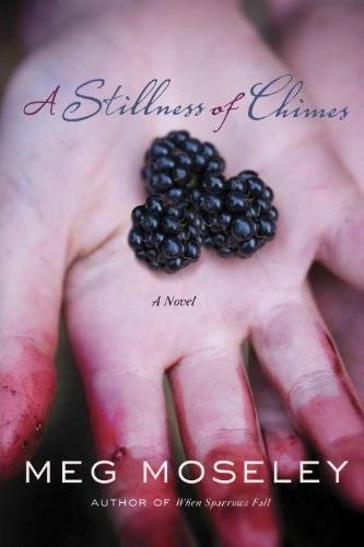
Meg Moseley’s intrigues me with the small hands and berry stains. It hints at mystery, and I know I’ll need tissues handy.
July 26, 2012 at 5:30 pm
Brenda Anderson » Hi Brenda ~ we are one with your thoughts on Lisa’s and Tosca’s covers! I like that you can look at a cover and give it a tissue rating, too 🙂
July 26, 2012 at 1:11 am
They’re all beautiful, but I loved Lisa Samson’s the most. The title, combined with the picture, promises an enjoyable read. I’d pick that one up based on cover alone.
July 26, 2012 at 5:31 pm
Ann Shorey » Me too, Ann!
July 26, 2012 at 1:57 am
Roses Have Thorns reminds of earlier ones by Jeane Westin
The Bergren one reminds my of Glamorous Illusions by Newport, because of the font.
But I love Gist’s! The coloring, the beautiful dress against an intriging background.. very well done!
July 26, 2012 at 6:19 am
And now I realize Glamorous Illusions is by the same author, hence the same font.. Silly me.. which means I’d better hurry up and read Glamorous Illuisions so I can read Grave Consequences.
July 26, 2012 at 8:39 am
Yes, The Pursuit of Lucy Banning by Olivia Newport and Glamorous Illusions from Lisa Tawn Bergren have different fonts, but both feature a beautiful socialite in pink! So at a glance, they’re not far off. 🙂
July 26, 2012 at 5:17 pm
Margaret @ Creative Madness Mama » Actually, you should compare Olivia Newport’s The Dilemma of Charlotte Farrow with Deeanne’s It Happened at the Fair – similarly themed covers, both with a ferris wheel 🙂 Check Olivia’s cover here
July 27, 2012 at 2:56 am
Well yes, there is that too. 🙂
July 26, 2012 at 5:31 pm
Marie » Love hearing your thoughts, Marie – thank you!
July 26, 2012 at 2:43 am
I think the Christy and Carol awards should start doing cover awards. There could be a design, stylist, photographer, artist award for the historical covers. I know some publishers use stock images from photo agencies for the contemporary books. They wouldn’t have an award for photographer on those, but there are plenty of graphic designers that should receive awards in that category.
July 26, 2012 at 8:12 am
Moseley’s the one that captures me the most. It’s so intimate; it’s like I’m leaning right over her hand and our heads are almost touching.
Samsons’s cover is good, but I’m not a big VW fan, especially the buses. So for me, while it’s pretty, I don’t know that I’d pick it up. Isn’t that silly? And it’s not even something the writer necessarily controls.
July 26, 2012 at 5:25 pm
Sally Bradley » My brother in law had a VW campervan when we were younger so I have a soft spot for them 🙂 I agree with you on Meg’s cover although the title doesn’t quite seem to go with the cover art, to me!
July 26, 2012 at 11:50 pm
I agree with you on Meg’s cover. I hope the back cover makes it clear.
July 26, 2012 at 8:36 am
Forsaken Dreams and Iscariot are the ones I am most taken with, but this post actually surprised me with books I did not know about! Then I ventured around Howard and found two more that I wasn’t expected including more Christian Historical Fiction. All are on my goodreads to-read list now!
July 31, 2012 at 12:04 am
Love Lisa Samson’s cover…hers are usually a bit unconventional and this one is no exception.
MaryLu book…Gorgeous cover (although I’m with Aaron – show the whole head)…love the colors and you can almost feel the mist in the air.
Love Deeanne’s … as you said, Rel, it definitely has that “olde world charm”. =)
Lisa Bergren’s … love the ethereal quality the moonlight gives it. Like Rissi, I’m wondering if it’s Pierre or Will…although that is not how I pictured either one of them.
Meg’s book…love the cover as it makes you want to know the story behind the berry-soaked hands. Christianbook has a different cover for this book seen here. Quite a difference, and the book blurb makes you wonder how the cover shown in your post ties in.
July 31, 2012 at 9:24 pm
Jenny » So, you’re not a fan of the headless covers, Jen?!
I just looked at the other cover – I think that is the third cover I’ve now seen for Meg’s book! The one I’ve posted is the one that Waterbrook currently has on their website so it will be interesting to see which one makes the cut.
July 31, 2012 at 1:39 am
LOVE LOVE LOVE MaryLu Tyndall’s new cover. And it’s SO well-deserved. I’ve loved her books from the beginning.
Next favorite is Sandra Byrd’s. Those costumes are STUNNING!!
Some day, maybe I’ll have a stunning cover–don’t get me wrong. I love my covers. But they aren’t going to win “beauty” contests, not when pitted against the likes of MaryLu and Sandra’s books. Hehe. And mine won’t be historical. LOL
July 31, 2012 at 9:17 pm
Ronie » Mmmm…Ronie writing an historical? Stranger things have happened ;-D I’m sure you would be up to the task whatever genre you decided to turn your mind to! I’m with you on loving MaryLu’s books from the start.