 So, I was going to whip up a super intelligent bookish question of the week but I got sidetracked by the cover reveal of Lori Benton‘s 2015 release, The Wood’s Edge. If you have hung around here long enough you know what a fan I was of Lori’s debut novel, Burning Sky, and while I still have to post my review of The Pursuit of Tamsen Littlejohn, I can assure you it is a wonderful read, although didn’t push Burning Sky off its perch in my mind.
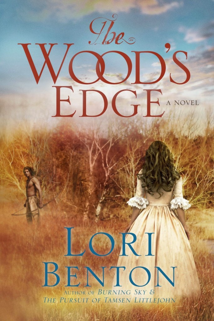
The Wood’s Edge is the first in the Pathfinders series so there will be more Lori goodness to come! To learn a little more about The Wood’s Edge be sure to check out Lori’s cover reveal post. I think this cover reflects the title, Lori’s writing style, the protagonists, and more. The autumn colours are gorgeous and while I think the hero could have been a little bit larger, I think it no doubt reflects his physical and emotional marginalisation in many ways.
There are covers that look pretty or eye-catching or are even just nice but there is something more every now and then. I call them covers that speak to me! Ones that provide real insight into the words inside and have me excited about reading the story, not because the cover is “pretty” but it communicates some of the intricacies of the story.
The heart of this cover for me is that it communicates so much, and even though there is no synopsis yet, I feel I know some of what this story will reveal.
So, my bookish question:~
Which book covers have “spoken” to you about the story inside?


August 27, 2014 at 2:41 pm
Is he asking her to follow him? Is he leaving her after she breaks his heart with a refusal? Or is she running to him with a “yes”, while he’s not certain if her answer is genuine after his broken heart? These are the questions that are begged to be asked!
August 28, 2014 at 1:02 pm
Good questions, Sylvia!
August 30, 2014 at 3:02 am
Ooo, I hadn’t thought of those scenarios! In my mind, they’d just stumbled on each other because she looks kind of frozen in fear. And he looks like he’s just noticed her so…
Can’t wait to read and find out!
September 4, 2014 at 11:29 am
I love all these questions you all are asking! They are good ones. 🙂
August 27, 2014 at 4:15 pm
Now that is one amazing cover. Outstanding work by the design team & Lori.
And that hair? Wow…
August 28, 2014 at 1:03 pm
My eldest two girls have hair like that – well, with some curling wand assistance 😉
September 4, 2014 at 11:30 am
Ian, that hair is quite perfect. I am so very thrilled with the hair. 🙂
August 27, 2014 at 10:16 pm
Rel! Thank you so much for spotlighting this new cover. I was able to see the last few stages of its development and am so pleased that it conveys so much of the story readers will encounter in its pages. It does so on quite a few levels. It’s wonderful that readers are already picking up on some of the story tension. A picture really is worth a thousand words, or in this case, well over 100,000.
August 28, 2014 at 1:04 pm
Thanks for dropping by, Lori ~ I think there are many of us who can’t wait to read the words behind the cover!
August 27, 2014 at 10:21 pm
Lovely cover, Lori! Thank you for sharing it, Rel.
August 28, 2014 at 1:04 pm
Always a pleasure, Tam – you know how much I love new cover art!
September 4, 2014 at 11:31 am
Tamara, thank you! I’m blessed with a brilliant cover artist in Kristopher Orr. I have been an admirer of your books covers lately too! They are lovely and rich.
September 4, 2014 at 12:04 pm
Ah, thanks, Lori! Happy writing 🙂
August 27, 2014 at 11:35 pm
I just finished “For Such a Time” by Kate Breslin. I read your review and despite your praise, I decided it wasn’t a book for me. But then I spotted it at my library and the cover drew me in. So glad it did as it was an AMAZING read and I haven’t stopped raving about it. Once again, you’ve proven yourself to me as my ‘go-to’ guide for great books. Also, I like the covers of Debbie Viguie’s Kiss Trilogy, because they had the hero’s picture on the front instead of the heroine’s which isn’t the norm. The men in the different types of clothing along with the cityscape instantly snagged my attention and made me wonder about the story. So glad they did as it was a series I thoroughly enjoyed.
August 28, 2014 at 1:06 pm
Oh,thanks, Amy – that’s so sweet of you! I agree with you on heroes on covers – it’s such a nice change, especially in the CBA where it is particularly rare.
Thrilled you loved Kate’s book – it always delights me when someone else enjoys a book I’ve recommended. You would think I’d written the book – hehe!
August 27, 2014 at 11:50 pm
I loved this post. I have read both of Lori’s books and loved them. All the covers are great. I am looking forward to reading her new ones as she has become one of my favorite authors. I loved the cover of The Pursuit of Tamsen LittleJohn.
I recently read The Pelican Bride and loved that cover also it was beautifully done as are so many others.
thank you
August 28, 2014 at 1:07 pm
Hi Jackie – yes, Beth White’s cover of The Pelican Bride is great.
August 28, 2014 at 4:51 am
This cover is very interesting. My only wish is that the heroine would be turned a bit to the side, not only to get a little of her face but to have her looking toward the heroine. The cover to me says it is set in Colonial America and deals with the meeting of two worlds represented by “the wood’s edge.” As for covers that spoke to me, I would have to say “The Honorable Imposter” by Gilbert Morris. I was reading secular historical fiction at the time but was very dissatisfied with much of the language and the lack of Christian values. When I saw the first cover in “The House of Winslow” series I was immediately hooked! I knew this was right in my wheelhouse as it was a historical during the early settling of America and was the first in a family generational saga, my favorite! The hero was showcased and flanked by two women, one a Pilgrim representing the spiritual and one in elaborate dress representing the world. My expectations were not let down but were exceeded. I was in love with Christian historical fiction!
August 28, 2014 at 4:52 am
Oops, I meant have her looking toward the hero.
August 28, 2014 at 1:08 pm
Love that it was a cover that really drew you in, Aaron – they really have significant power, don’t they? I agree with your thoughts on the cover and title of Lori’s book – very deliberate and considered, I feel.
August 28, 2014 at 5:07 am
The Wood’s Edge is a lovely cover – – but…. my all time favorite “hands-down” winner for best-ever covers is “The Age of Faith” series by Tamara Leigh. With both the hero and the heroine on the cover of each book – – sooooo beautifully romantic, so breath-taking…..each cover is a “sigh…t” to behold!!!!
August 28, 2014 at 1:09 pm
Hey Pam – don’t you just love Tamara’s books? Sigh worthy, inside and out!
August 28, 2014 at 6:11 am
Oh so excited 🙂 Lori’s books would be amazing regardless of the stunning covers, but the fact that they have them too just makes them even extra wonderful!
August 28, 2014 at 1:09 pm
Yes, yes, yes!! Thanks for commenting Meghan
August 31, 2014 at 3:59 am
Lori’s cover is beautiful, and it does provoke questions about what’s inside! Can’t wait to read it – I’ve loved both of her novels! I’ve always loved Siri Mitchell’s cover on A Heart Most Worthy, too!